Welcome to the KNOW Search Visualization User Product Page!
The
KNOW project (https://depts.washington.edu/knowjsis/home/index.php) aims to create an
easily-browsable and searchable collection of news
sources from around the world. The collection is curated by members of the KNOW
project and students in the Jackson school of International Studies at the
University of Washington; this imparts value not found with standard search
engines or other online news collections.
KNOW
Search visualization transforms a list of articles returned by a search query
into multiple visualizations that will allow you to gain valuable insight. This
allows you to combine information from multiple sources to gain new
perspectives and further their research.
This web tool features five visualizations:
· Heat Map – A visual representation of how many articles were
found for each country
· Timeline – A visual representation based on his search query
with emphasis on time
· Word Cloud – Lists out key words from the articles of a user’s
research result
· Article Cloud – A visual display of related articles to
encourage exploration across entire annotation database
· Article List– A traditional list of articles for users to browse
You may access and start using KNOW Search Visualization from any
web browser at http://depts.washington.edu/knowcse1/
How to use KNOW
Search Visualization
The
web tool is broken into three major frames:
1.
A navigation bar at the top to toggle between
visualizations.
2.
A search box on the left where you can specify KNOW category,
country, and time period.
3.
The main pane in the center that displays the
current search visualization.
When
you first access the web tool, the default visualization feature is the Heatmap and it displays a blank map of the Earth.
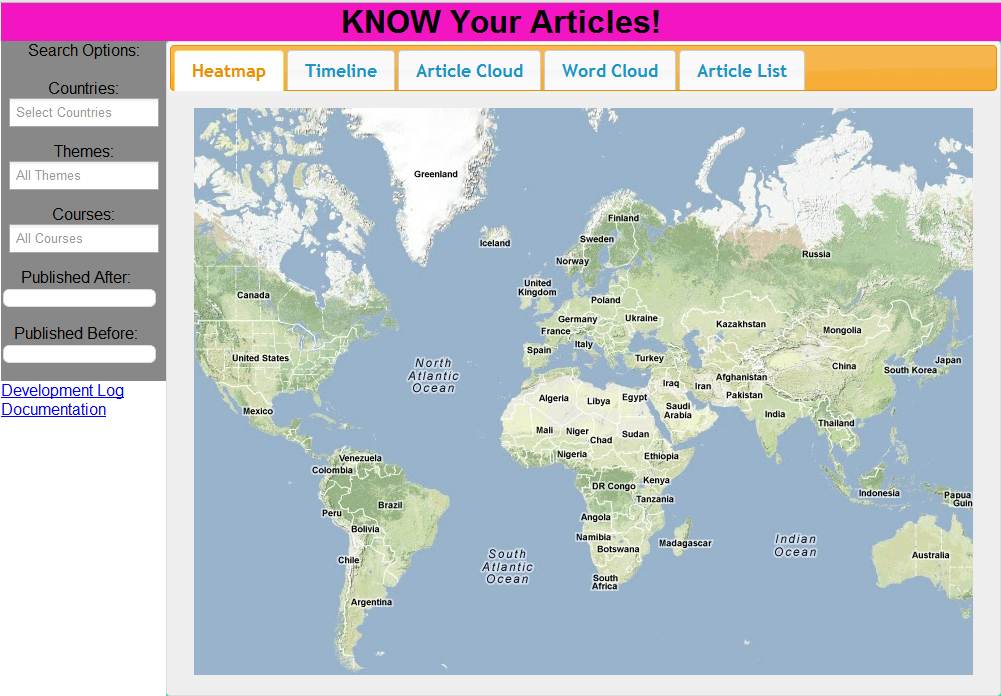
The initial
screen for the KNOW visualizations project.
Search
Box
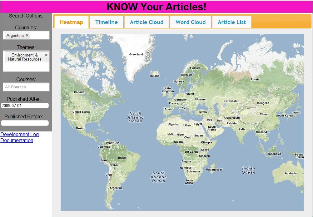
The
search box allows you to specify the KNOW category, country, and time period.
As a default, the KNOW category is set to all, the country is set to world and
the time period is set to the current range of the KNOW database. You select
the KNOW category via a drop down list. You select the country via a drop down
list. You selects the time period via two free text fields where you specify
the dates in yyyy-mm-dd
format.
An example of
entering search terms in the search bar.
Visualization
Navigation Bar
The
search options in the search box will be persisted when selecting a different
visualization tab. You can easily toggle between different visualizations for
the same search query by selecting your desired visualization from the top
Navigation bar.
An example of
switching to another visualization by clicking on a
different tab.
Specific Search Visualizations
This section will describe how to use each visualization feature.
Heatmap
The heatmap displays the distribution of found articles by country. When you have selected a set of search terms, the heatmap will update and show red circles on the map. Each circle corresponds to a country that was represented in the results of the search. Circles are shaded according to how many articles were found from that country; the darker a circle is, the more articles were found from that country. Hovering over a circle will display how many articles were found from that country.
Timeline
The timeline maps out the found articles by when they were published, and allows you to preview an article. Once you have done a search, the timeline will update and show the articles found by the search along a time line, located at the bottom of the pane. You can move along the timeline by dragging the bar left and right. Clicking on an article box will focus the timeline on that article and display a preview above the timeline.
Article Cloud
The article cloud allows you to “walk” along articles, moving from related article to related article until you find one that interests you. Once you have done a search, the article cloud will randomly pick one of the results to be the “center” of the cloud, and will draw related articles (if any) around the central article. Surrounding articles will show how they are related to the central article. You can click on a related article to make it the center of the cloud and see what articles are related to it. You can also click on the “Go Take A Look” link to view the article itself. You may also use the “refresh” button in the lower-left of the visualization to regenerate the article cloud with a new, randomly-picked article from the search results as the center of the cloud.
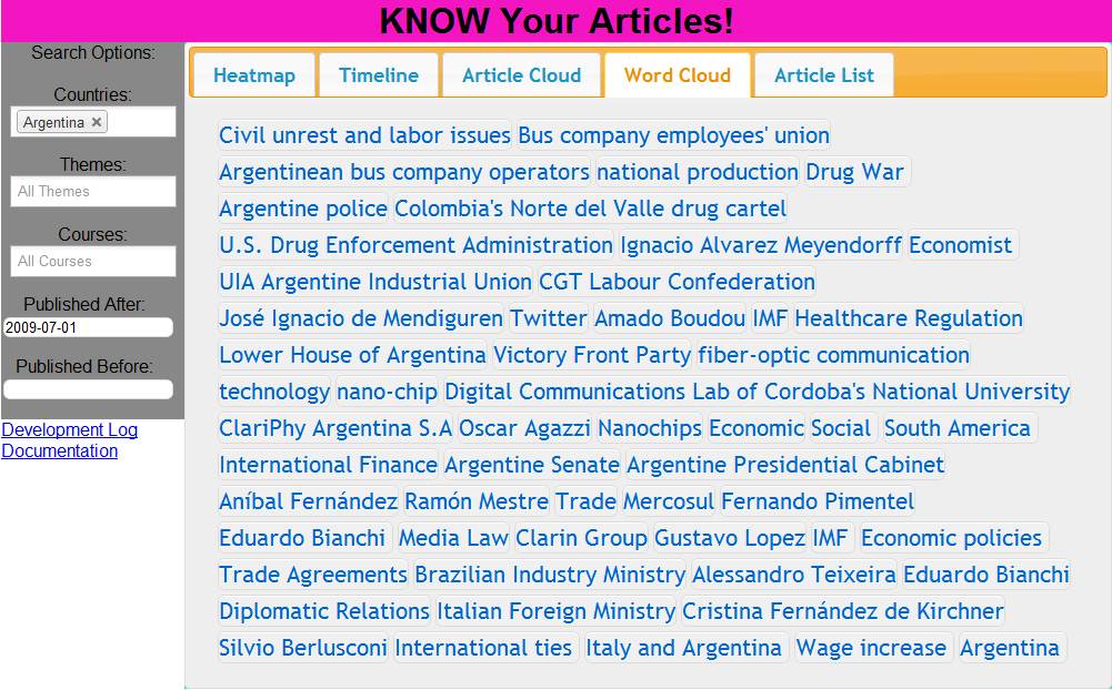
Word Cloud
The word cloud allows you to see common words and themes among the articles that were returned by the search. Words are colored differently based on how commonly they appear in the results. You can click on a word to get a list of what articles have that word or theme; clicking on an article title in the list will take you to the article itself.
Article List
The article list simply displays the results of the search as a list. The country of each article is also displayed below the article title. You can click on the article title to view the article itself. Use the drop-down “page” menu to move between different pages of the results.
Did you find a Bug?
We’d be very grateful if you could tell us about it! Every bit of information that you can give us will help us continue to make our visualizations better and less prone to breaking in the future. Please email our Project Manager, Kimberly Nguyen, at kimberlyyh.nguyen@gmail.com with the error code, active visualization, search terms used, and any other details that you can provide us. Thanks for helping us make this service better!
Developer Documentation
If you were looking for developer documentation, click here.