![]()
![]()
![]()
|
A new form of advertising that developed early in the 20th century was the calendar poster. Major companies would present these calendars as gifts to their clients at the beginning of the Chinese New Year. These posters usually had a large glossy image in the middle with calendars for one or two years on the sides. While strikingly different in content and style, this method of marketing does have its roots in the tradition of Chinese folk prints, colorful pictures exchanged at the New Year. The subject matter of such prints usually drew from a body of popular folklore and auspicious symbols. In contrast, calendar posters presented new cosmopolitan images targeted at the growing urban middle class. As you look at some of the examples of advertising posters below, think about the intended audience of these ads. Why do you think images of women were so frequently used in advertising? How do these calendars compare with western advertising strategies? |
|

The majority of
advertising revenue in the 1920s came from pharmaceutical, cosmetic, and
tobacco companies. To the left is an advertisement
calendar for the Nanyang Brothers Tobacco Company from 1921.
This image draws from Chinese landscape and portrait painting traditions, as well as new ingredients from Western art.
Can you identify
elements that reflect these sources? What strikes you about the model’s face? |
|
|
|
|
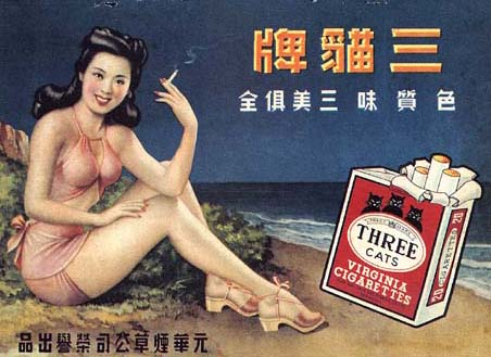
Compare the
calendar for "Three Cats" cigarettes below (1930s) with the BAT ad
above. |
|
|
|
|
|
|
|
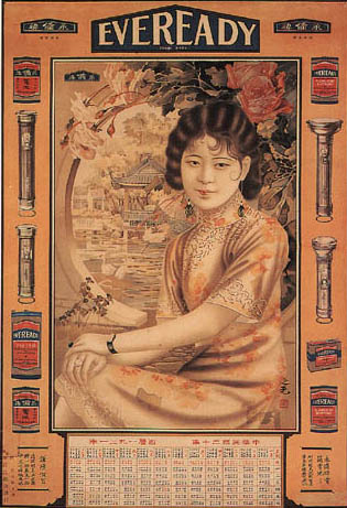
To the left is a poster for Eveready Batteries from 1931.
Looking at the technique, the pose, the style of the foliage, the architectural details, and the composition, which aspects strike you as more Chinese or more Western?
|
|
|
|
|
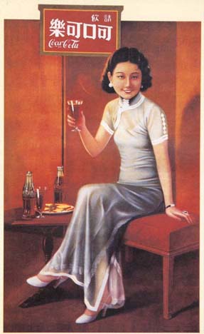
In the advertisement for Coca Cola to the right, the name "Coca Cola" was translated into four Chinese characters that sound similar and mean "delicious and fun." Compare this image with the Nanyang Brothers Calendar above.
What might account for the change in dress and pose?
Compare this
calendar to the folk print.
What
differences do you see in their color and tone?
|
|
|
|
|
To the left is an advertisement for Grande, Price,
& Co. from 1934.
According to a 1930 article in the
magazine The Modern Lady, it is improper for a lady to sit with her
legs crossed.
Look carefully at the picture.
What are some other signs of "un-ladylike" behavior? How can we tell she is not alone? |
|
|
|
|
Move on to Magazine Advertisements |
|