Description of Data
The visualization tool is based on the data of editors who have participated in editing Article pages in Wikiproject between August 1, 2003 and July 31, 2013. We only included editors who edited articles with the quality assessment, but we excluded editors who have never contributed articles. For example, although an editor has only contributed to Talk and User pages on any Wikiprojects, the editor is not included in our visualization.
Description of Visual Elements
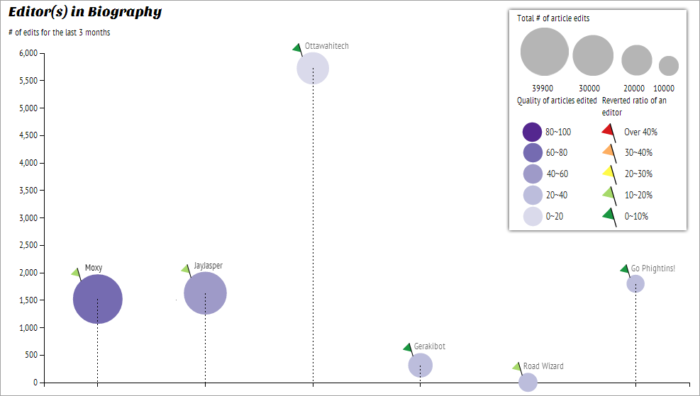
Figure 1. Example screen of visualization and its legend
-
Magnitude of circle: Prolific ContributionAn editor’s number of article edits is reflected in the size or magnitude of the circle representing that editor.
-
y-Axis Position of circle: Recent Frequency of ContributionThe position of y-Axis of each circle is representative of how frequently the editor has edited articles in the last 3 months. A higher position is indicative of an editor who edits more frequently than an editor whose circle is located in lower position.
-
Sequential color of circle: Quality of Articles EditedThe sequential color of an editor’s circle corresponds to the rate article quality of where that editor has contributed. For example, if an editor has contributed to many featured articles, the corresponding circle would be more dense. If an editor has contributed primarily to stub articles, the circle would be bright.
-
Flag color of circle: Reversion of EditsThe color of flag of a circle corresponds to how frequently that editors are reverted. Color is divergent from red to green, red flag means the editor's reverted ratio is over 40% whereas green means the editor's revertid ratio is below 10%.