The Bank of International Settlements provides official REERs but define the exchange exactly opposite to the textbook. A simple to invert these REERs is to manipulate them in FRED.
REER
Reply

The Bank of International Settlements provides official REERs but define the exchange exactly opposite to the textbook. A simple to invert these REERs is to manipulate them in FRED.
Interest Differentials between Chinese yuan denominated assets and the rest of the world have been sustained because capital mobility is severely restricted via capital controls (discussed previously in this link). This generates of course amazing profit opportunities, as outlined by this Bloomberg article.

A World Bank Study provides a comparison of 189 economies worldwide (link)

A fascinating paper by Anthony Atkinson, Thomas Piketty and Emmanuel Saez in the Journal of Economic Literature, condensed and interpreted by Uwe E. Reinhardt @ the NYT Economix:

its a good exercise to figure out why median and mean income diverged so dramatically while per capital GDP kept growing. The answer is on Reinhardt's blog, and its depressing.
The hope for a quick recovery are muted. State revenues are recovered strongly – but only in some states. Slow revenue growth foreshadowed the recent downgrade in GDP… Policy makers celebrated the end of the contraction, but the absence of a recovery that returns us back to trend growth is worrysome.
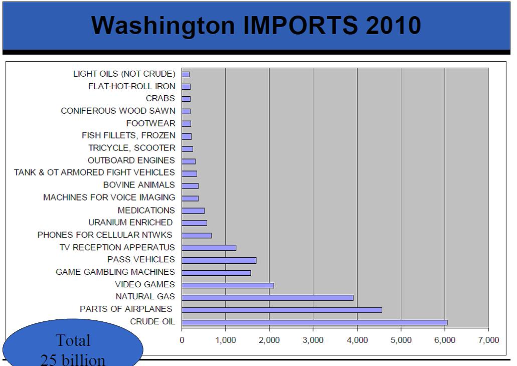
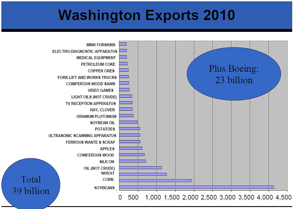
Washington State is still in a revenue slump, while the rest of the states seem to be recovering according to the Wall Street Journal. The Census provides detailed data on state revenues
Why rely on Purchasing Power Parity adjusted GDP to assess development. Here are much more convicing measures:
Light


Locations of Friends

Air Traffice
The Bank of International Settlements reports that the DAILY foreign exchange volume has just about cracked the $4 trillion mark. Up from $3.3 trillion in 2007. To get an idea of the unbelievable scale of these flows, the DAILY turnover is thus larger than the total ANNUAL income of any European economy (for example, FX turnover is twice the size of the UK's ANNUAL income) and DAILY FX flows are about 1/3 of the ANNUAL income in the US. Or, to ballpark it, ANNUAL FX flows are about 70 times larger than ANNUAL US GDP…
Interestingly, the dollar maintains its status as the worlds reserve currency, despite the subprime crisis, despite quantitative easing (rounds I and II), despite record fiscal deficits, and despite the zero interest rates policy of the Fed.

States That Received the Most (per capita) Federal Stimulus Funds

Note the interesting correlation to the change in tax revenues across states

with a tip of the hat to the tax foundation that identified revenue sources by type
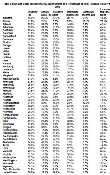
Source: Tax Foundation
A comparison of real time yields for European Country Debt is now available from Bloomberg. Calculated Risk has the instructions:
Click here for the graph for the Greece 10 year bond yields. Then you can add other bonds for comparison. Where it says "Add a comparison" you can enter the symbols for Germany (GDBR10:IND) and then Ireland (GIGB10YR:IND) to create this graph. Here are the symbols for Portugal (GSPT10YR:IND) and Spain (GSPG10YR:IND)
A fantastic, dynamic graph of the Fed's Balance Sheet, by credit facility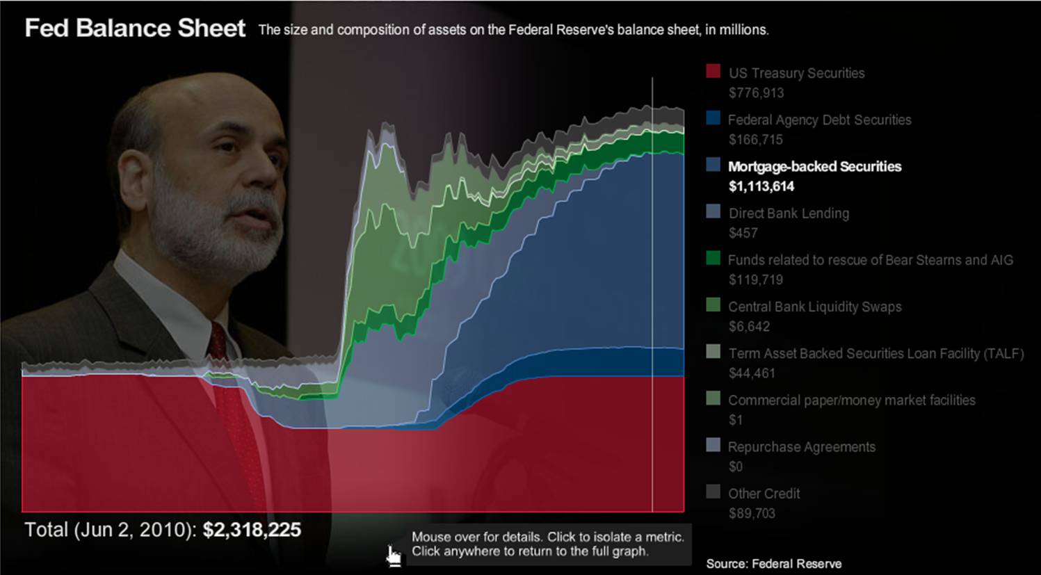
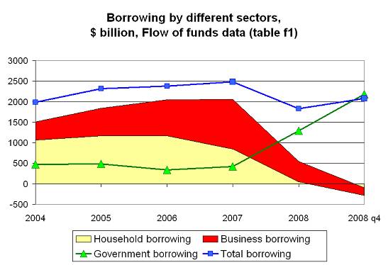
Joe Stiglitz says it all in a nutshell: The Federal Reserve Board is no longer the lender of last resort, but the lender of first resort. Credit risk in the mortgage market is being assumed by the government, and market risk by the Fed. No one should be surprised at what has now happened: the private market has essentially disappeared.
Hans Rosling believes that making information more visually accessible has the potential to change the quality of the information itself. His website Gapminder allows data to be displayed to experience development in motion. He also has a great TED talk. Here is one of his pictures:

Data Sets and visualization tools (check out the data visualizer and interactive maps)
Debt Sustainability Model Plus
WorldDevelopment Indicators
GlobalDevelopment Finance
AfricanDevelopment Indicators
MillenniumDevelopment Indicators
GlobalEconomic Monitor (GEM)
ActionableGovernance Indicators
BulletinBoard on Statistical Capacity (BBSC)
DoingBusiness Database
EducationStatistics
Enterprise Surveys
GenderStatistics
HealthNutrition and Population Statistics
InternationalComparison Program
JointExternal Debt Hub (JEDH)
LogisticsPerformance Index (LPI)
PrivateParticipation in Infrastructure (PPI) database
QuarterlyExternal Debt Statistics (QEDS/SDDS)
QuarterlyExternal Debt Statistics (QEDS/GDDS)
WorldwideGovernance Indicators (WGI)
Rural and Urban Development Datasets
The OECD Factbook is now online, and hooked up to all sorts of online datasets and interactive maps/graphs.
The Bank for International Settlements maintains a rich time series on real effective exchange rates. Interestingly, Econbrowser uses the data to show that the appreciation of the dollar against the euro is much less pronounced when we look at the broadest exchange rate measure. The answer is of course China holding its exchange rate with the US fixed.
The euro and the dollar. First, here is a graph of the dollar/euro exchange rate expressed in units of USD per EUR.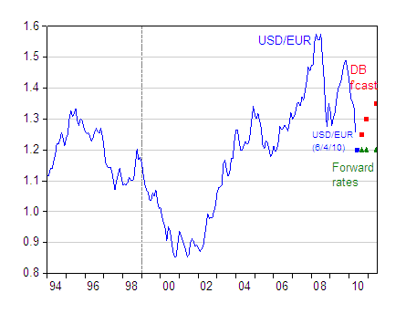
Figure 1: USD/EUR exchange rate, monthly averages (blue line); synthetic euro before 1999M01. USD/EUR exchange rate on 6/4/2010 (blue square), Deutsche Bank forecasts as of 6/4/2010 (red squares) and forward rates (green triangles). Source: Fed via FREDII, Deutsche Bank, Exchange Rate Perspectives, June 8, 2010 [not online].
The euro has declined precipitously since late last year. As of June 4, the USD/EUR rate was 1.2. Forward rates (which have little predictive power, and usually point in the wrong direction [2] ) imply no change. The Deutsche Bank forecast is for strengthening against the dollar, rising to 1.35 USD/EUR in a year’s time.
That’s just one forecast, and given the uncertainties regarding the resolution of the euro area’s fiscal problems, there is little reason to put too much credence on this particular forecast. But this brings me to the second point. Despite the euro’s depreciation, the dollar has exhibited much less movement on a real, trade-weighted, basis.
Figure 2: Log broad trade weighted real USD (blue bold), CNY (red) and EUR (green). Source: BIS and author’s calculations.
The data on this graph only extend up to 2010M04. The USD in nominal terms, on a broad basis, has appreciated by 2.8% (log terms, not annualized) in May. Still, that puts into perspective the fact that the USD is roughly where it was on the eve of the Lehman collapse.