
The updated UW Medicine logo reflects our dedication to providing a higher degree of healthcare while connecting us more deeply to the University of Washington. This refresh strengthens clarity and trust across all audiences — patients, staff, donors and community members — and allows us to offer a unified message of care, learning and collaboration.
Our brand began this transformation nearly 10 years ago by adopting purple as our primary color, replacing the previous gold. We also incorporated the UW fonts. In 2019, we introduced our new tagline, “A Higher Degree of Healthcare,” which emphasizes our identity as the only academic medical center in the Puget Sound region. The new logo and brand architecture represent the culmination of this evolution.
Please note that you are not expected to switch everything to the new logo immediately; there will be a transition period during which you can use your existing printed materials and plan digital updates. Due to cost considerations, signage will take longer to update.
About the Logo Update
Q: Why is the logo changing?
A: The updated logo is part of UW Medicine’s effort to better reflect our leadership as an academic medical center and our connection to the University of Washington. This refresh enhances trust and recognition and emphasizes our brand promise: A Higher Degree of Healthcare.
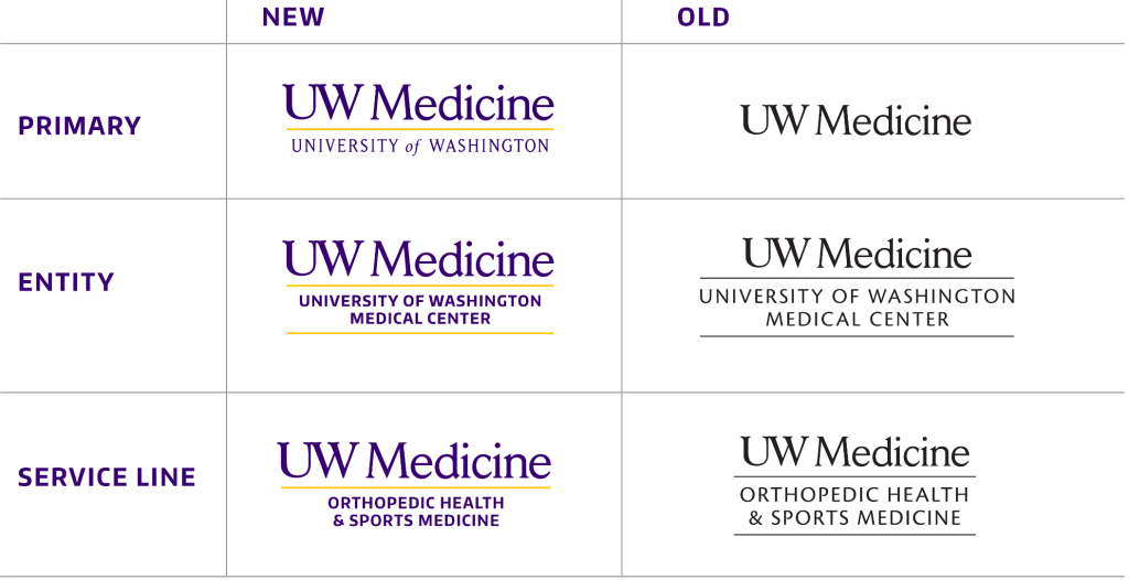
Q: What are the key differences between the old and new logos?
A: The refreshed logo has the following features:
- University of Washington wordmark: Adding this reinforces our role as the only academic medical center in the region and ties UW Medicine more closely to the university.
- Bolder typography: Modernized for readability and professional impact, creating greater recognition and digital adaptability. Using Encode Sans font also aligns more closely with the UWs visual identity.
- Yellow keyline: A bold visual symbol.
- Purple font: Instead of using black font, the full-color logo incorporates our primary brand color.
Q: What does the updated logo represent?
A: The refreshed logo represents UW Medicine’s unified identity and promise to deliver exceptional care while advancing research and educating future healthcare providers. It reinforces clarity and trust across all interactions — local, regional, national and beyond. It also clarifies the “UW” in UW Medicine for audiences outside the region.
Q: Is this a complete rebrand or a refresh?
A: This is a logo refresh. We are building on the strengths of UW Medicine’s current identity while modernizing its visual expression to unify all entities under one cohesive brand architecture.
Q: Are we changing how to reference UW Medicine?
A: Yes, you may now describe UW Medicine as the University of Washington’s health system. Especially outside of our region, this change helps define and differentiate ourselves from other academic medical centers with similar names, such as UW Health in Wisconsin.
However, please do not use “UW Medicine/University of Washington” as a shorthand description. Instead, use “UW Medicine, the University of Washington’s health system” as the first reference when it makes sense.
Brand Architecture
Q: What is brand architecture?
A: A clear brand architecture or structure helps UW Medicine stay visually organized and makes it easier for people to understand its services. Key benefits of having a strong brand architecture include:
- Boosting recognition: An organized brand helps people easily recognize UW Medicine.
- Clarifying communication: It clearly shows how the main brand (UW Medicine) relates to its sub-brands and services, like clinics and academic programs.
- Improving marketing: Clear messaging reduces confusion, making marketing campaigns more effective.
- Protecting reputation: Consistent tone and visuals help maintain trust in the brand.
Q: What changes are being made to the brand architecture?
A:
- Unified branding: All clinics, shared services and programs will now use the UW Medicine primary logo.
- Refreshed entity logos: Bolder fonts and two yellow keylines to connect with the new primary logo. The university wordmark will not be used in these logos.
- Refreshed service line logos: Bolder fonts and one yellow keyline to connect with the new primary logo. The university wordmark will not be used in these logos.
- Abbreviated logo: For use in digital and other communications where space is limited. The university wordmark will not be used in this logo.
- “Remote treatment” approach: A simplified design system that will ensure clarity while maintaining flexibility for highlighting individual offerings (see Remote Treatment Framework below).
Q: Who should use UW Medicine branding?
A: All clinically integrated parts and business units of UW Medicine must use our branding. There are a few exceptions, such as Fred Hutch, which is an independent organization with its own branding.
For academic departments and research centers, it is strongly recommended to use UW Medicine branding to ensure consistency across the organization and reinforce their connection to the UW Medicine mission. Academic departments, such as the Department of Medicine, may also use remote treatment with the new UW School of Medicine entity logo.
The block “W” icon may be used for academic or educational purposes (e.g., student communications), but it should not be used for clinical or patient-facing materials. Anything related to health system activities or patient care must always use UW Medicine branding, not UW branding.
Q: Why won’t entity or service line logos use the university wordmark?
A: The decision to exclude the university wordmark from entity and service line logos creates a simpler visual identity for UW Medicine, avoiding a complex three-tier logo that looks wordy and would be challenging to use in many formats. However, there is an exception: service lines and entities may use the primary logo when adopting the “remote treatment” branding approach. This method visually separates the name from the primary logo, ensuring clarity while better emphasizing service line offerings (see Remote Treatment Framework below).
Q: Why move away from logos for programs, shared services and offices?
A: UW Medicine’s unified visual identity reinforces its systemwide approach to care and builds a stronger brand. The refreshed logo and brand architecture ensure patients feel connected to an integrated health system, and our community feels trust and loyalty.
Too many logos dilute UW Medicine’s brand equity and create confusion. By aligning under the primary logo, we strengthen trust and simplify navigation through our integrated health system for patients, staff and the community.
Sunsetting two-tiered logos for shared services and other departments does not mean we are removing names. Each department name will still feature prominently within communications, just with consistent alignment to the primary UW Medicine branding. Entities, specialties and service lines will also retain their logos.
Q: May we use icons with our logo?
A: No, icons or other artwork may not be locked up with any logos. While artwork and creative elements can be incorporated into other aspects of your materials, these elements must remain visually separate from the UW Medicine logo to preserve the integrity and clarity of our systemwide branding. Here is an example of appropriate artwork use:
The example shows how artwork can be applied to apparel with visual separation from the primary logo.
Remote Treatment Framework
Q: What is remote treatment branding?
A: In logo design, remote treatment means separating visual elements, like logos, text and sub-brands, while keeping a consistent brand image. This approach provides clarity and flexibility when showing different services under one main system, such as the UW Medicine primary logo. Remote treatment helps create a clear visual hierarchy and differentiation, while also protecting the main brand’s identity.
This approach highlights each team’s role in the UW Medicine integrated system while streamlining branding across care, education, research and shared services.
Q: How does it work?
A: Remote treatment provides a flexible way to highlight individual offerings while maintaining branding consistency.
- Primary logo first: The primary UW Medicine logo is the foundation. It clearly shows the system’s identity and serves as a central point for all communications, ensuring consistency across the brand. In some cases, it may make sense to use an entity or service line logo as the foundational element.
- Text offerings: Clinics, departments, offices, programs or units are shown as text, set apart from the primary logo. This text follows specific visual guidelines for professionalism, legibility and alignment with the brand.
- Clean design: Proper placement and spacing help distinguish the primary logo from department, team or office names. This design simplifies navigation, improves readability and helps the audience grasp the structure without confusion.
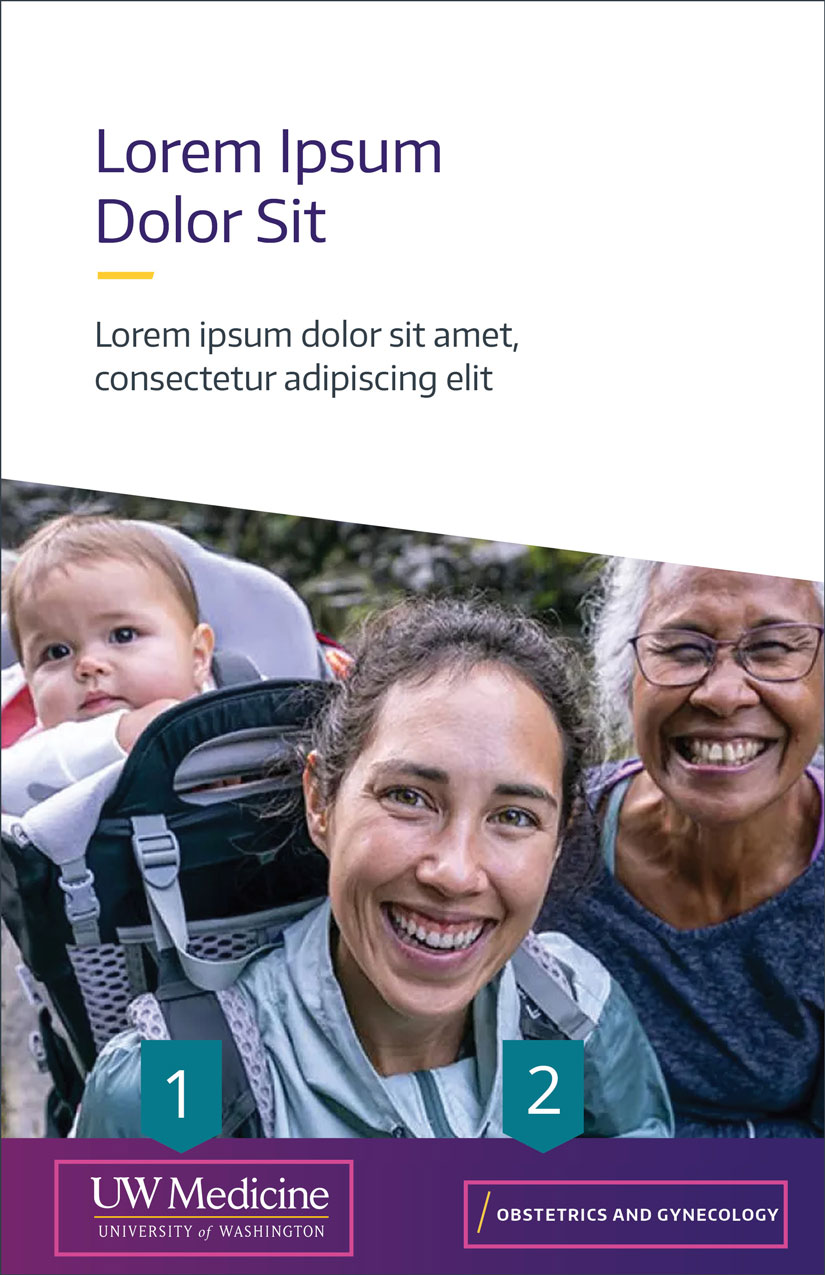
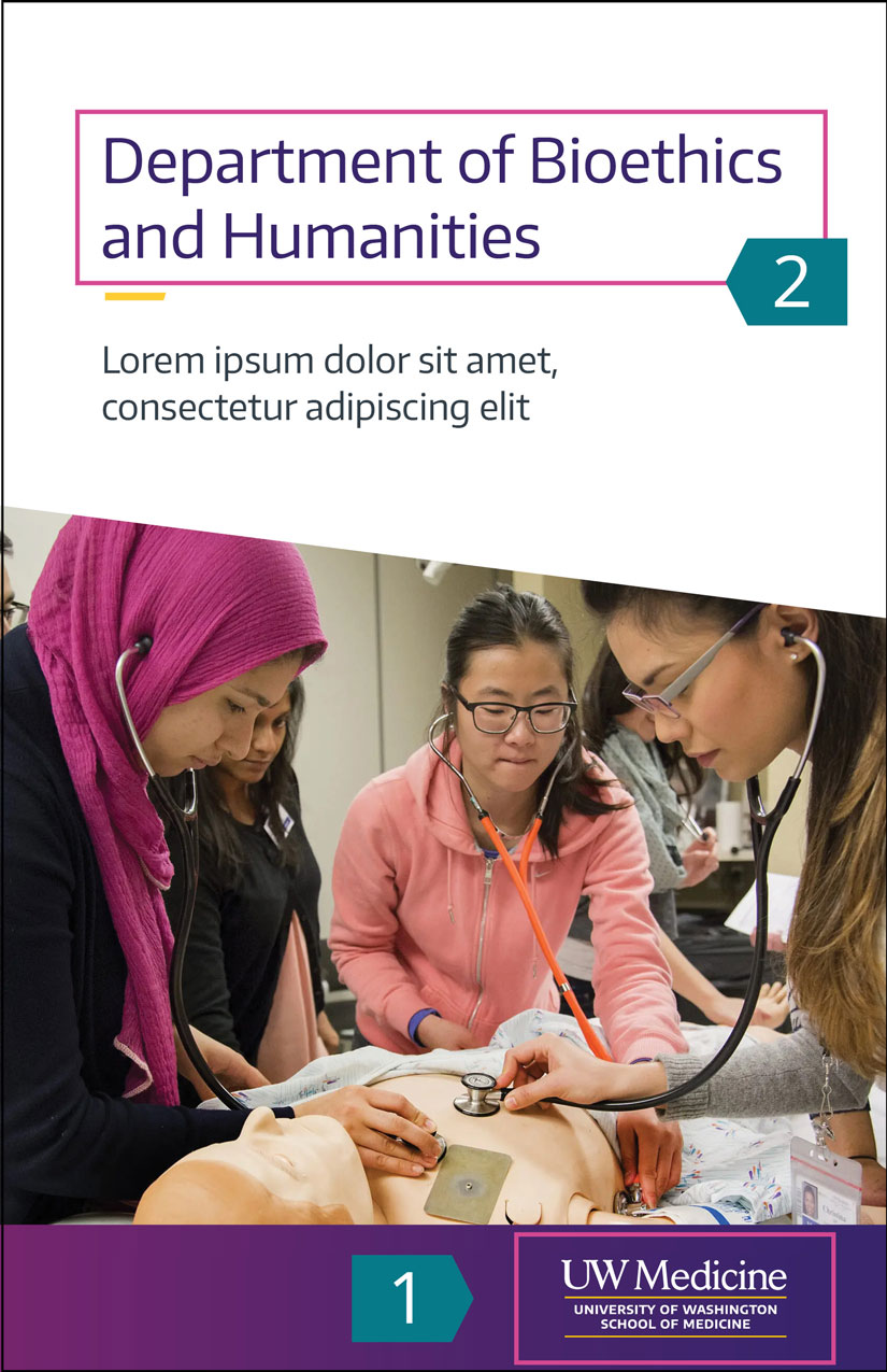
Examples of brochures using remote treatment
Examples show how the primary or entity logo (1) is paired with a department name (2) using remote treatment.
Q: Why is remote treatment branding important?
A: Remote treatment simplifies branding, reduces confusion and emphasizes each offering as part of UW Medicine’s integrated system.
Each department, team or office can be unique while still promoting brand recognition and protecting the primary logo’s value. For UW Medicine, this approach allows for a flexible way to represent different services, all while reinforcing a unified identity.
Q: Are there exceptions?
A: Yes, entities, specialty departments and service lines maintain their logos. Harborview, Airlift Northwest and WWAMI retain their unique logos.
Some situations may require remote treatment with secondary logos, such as when referring to a unit within a hospital like UW Medical Center or Harborview Medical Center.
Q: May service lines use remote treatment?
A: Yes, and it is necessary if a service line wants to use the new primary logo with the university wordmark or the new primary logo and tagline.
Implementation Details
Q: Where will the new logo appear first?
A: Digital platforms, including the UW Medicine website, will lead the rollout in early September 2025.
Q: When will print materials, signage, uniforms and printed materials be updated?
A: Physical updates, such as signage and uniforms, will be gradually implemented as needed. Print materials may be used until a new print run is required. As older materials are refreshed, they will transition to the new branding guidelines.
Q: Should teams discard older materials with the old logo?
A: No. Legacy materials can continue to be used until inventory is depleted or updates are needed. As older materials are refreshed, they will transition to the new branding guidelines.
Q: Will templates and tools be provided to help transition?
A: Yes. The Brand Identity Resources site will include logos, PowerPoint templates, email signature designs, document templates and Zoom backgrounds.
Q: Can academic departments keep their current websites?
A: Yes, existing websites using UW templates with or without the block “W” logo can continue to be used for academic and internal purposes. We do ask that the logo be updated. Please use the new UW School of Medicine entity logo, which spells out the university name for better clarity.
Q: When is it appropriate to use the block “W” in academic department communications?
A: Academic departments may use the block “W” logo for materials related to academic matters, such as faculty and student communications or content tied specifically to the academic mission of the department. The block “W” reflects the department’s connection to the University of Washington while distinguishing it from patient-facing or clinical efforts. However, it may never be locked up with UW Medicine logos or be used on any patient-facing materials.
Q: What branding should academic departments use for clinical and patient-facing communications?
A: For any clinic or patient-facing communications, academic departments must use UW Medicine branding. This ensures consistency with the healthcare system’s identity, builds patient trust and reinforces UW Medicine’s reputation for high-quality care. Again, UW branding, including the block “W,” should not be used in patient-related materials or with the UW Medicine primary logo.
Audience Communication
Q: How will UW Medicine communicate these changes?
A: Patients and the broader community will be informed through a UW Newsroom post and social media. Messaging will emphasize continuity of care while highlighting the unified identity and connection to the University of Washington. Internally, Vitals serves as the primary source for updates, alongside the brand identity resources site.
Q: Will there be a public marketing campaign?
A: The new logo will not have a dedicated campaign or a large promotional push. However, informative updates on social media and the UW Medicine Newsroom will help patients and the community understand the changes. The logo also will be incorporated into new marketing campaigns.
Q: How should external partners and vendors be informed about the refresh?
A: Use this statement:
We’ve refreshed our logo to better align with our shared mission of delivering integrated, innovative healthcare. This update strengthens our connection to the University of Washington while ensuring consistency across programs and services.
Practical Resources
Q: Where can teams access the new logo files and templates?
A: The Brand Identity Resources website will host all downloadable files, including logos, templates and branding tools.
Q: What kind of resources will be provided?
A: The resources include:
- Logo files in various formats
- Updated templates (e.g., for PowerPoints, business cards, collateral)
- Typography and color palette guidance
Q: What are the do’s and don’ts for using the new logo?
A:
Do
- Use approved logo files provided by the Brand identity Resources site.
- Respect clear space and adhere to size guidelines for text placements.
Don’t
- Modify, recolor or distort the logo in any way.
- Add unapproved taglines, artwork or graphics that conflict with design guidelines.
- Use outdated or unapproved versions of the logo on new collateral. You may continue to use existing print collateral until it is gone.
- Create new logos or unique branding for apps, initiatives, clinics, programs or departments without permission from Strategic Marketing & Communications. This includes any combination of UW branding, independent designs or custom logos.
Q: Who can answer additional questions about the logo refresh? A: Contact Strategic Marketing & Communications at uwmmktg@uw.edu.