Overview
Buttons are interactive elements designed to trigger a clear, specific action on a webpage such as submitting a form, starting a process, or completing a task. They should be visually distinct, clearly labeled, and communicate exactly what will happen when clicked.
Use buttons for actionable tasks. For example, initiating a primary action (“Sign Up,” “Schedule Now,” “Submit”), confirming or cancelling a choice (“Save,” “Cancel”), or performing actions that change data or system state (“Delete,” “Publish”). Do not use buttons for static navigation links or purely informational content.
| When in doubt, just remember: Buttons are for actions that users take. Links are for navigation to other pages. |
Component Elements
Figure 1.0 – Primary and secondary button naming diagram
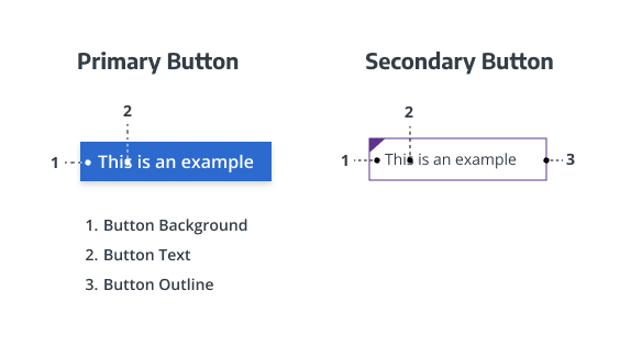
- Button background: Makes the button stand out and shows its importance on a page. Required, but can be transparent.
- Button text: Tells users what action the button performs. Required.
- Button outline: Defines the button’s edge, helping it to stay visible against a background. Required depending on button variant.
Button Types & Usage Guidelines
When to Use
- Use for actionable tasks where user intent triggers a process or system response.
- Use to highlight key actions on a page (e.g., “Schedule an Appointment,” “Find a Doctor,” “Pay a Bill”).
- Use when an immediate, visually distinct call to action supports task completion or conversion goals.
When to Avoid
- Avoid using buttons for navigation to static content or external links. In those cases, use text links instead.
- Avoid when there is no clear or measurable action associated with the element.
- Do not use multiple primary (filled) buttons in the same visual area. Instead, combine with secondary or link styles for hierarchy.
Component Variants
Primary Button (Solid Fill)
Purpose: Emphasizes the main page action or key appointing action.
Example Use Cases: “Schedule Now,” “Submit,” “Sign In.”
Visual Characteristics:

- Background: UW Medicine Blue #2C6ACE
- Text color: White
- Font: Open Sans, 16 px, line height 22 px
- Text case: Sentence case (capitalize only the first word)
- Box shadow: 0 3px 6px rgba(0,0,0,0.16)
- Hover: Darker blue #21509C
- Focus: Visible outline per WCAG standards
- Active: Consistent color and shape feedback
- Disabled: Muted tone with no hover/focus effect
Homepage Variation:
For hero areas, use Purple (#32006E) for inactive and Magenta (#76236C) for hover.

Provider & Location Card Variation:
The only exception for fill buttons to be in ALL CAPS, is if it appears within a provider or location card or directly below a row of cards.
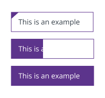
Secondary Button (Outline Ghost)
Purpose: Supports secondary or less prominent actions.
Example Use Cases: “Learn More,” “Contact Us,” “Read More.”
Visual Characteristics:
- Available Colors: Blue, Maroon, Red, Purple, Teal, Yellow
- Outline Style: 1 px border in selected color
- Typography: Encode Sans (Normal or Narrow), 13 px, Medium weight
- Text color: Matches border
- Opacity: 40% default, 70% hover
- Background: Transparent
- Hover: Border darkens, maintaining accessibility contrast
- Variants:
- Ghost Button: Transparent with border
- Reversed Ghost Button: Light border on dark backgrounds
Usage Notes:
- Use Purple on white/light backgrounds.
- Use Yellow on dark backgrounds.
- Do not combine multiple outline colors in the same region.
Tertiary Button (List Link)
Purpose: Offers lightweight visual affordance in lists, cards, or link groups.
Example Use Cases: “See all services,” “View profile,” “Read full article.”
Visual Characteristics:

- Font: Encode Sans Narrow, Regular, 16 px
- Text color: #474747
- Border (rule) color: #BABABA
- Hover: Text color changes to UW Medicine Blue #2C6ACE
- Alignment: Left-aligned within its container
- No fill or box shadow
- Subtle motion or underline on hover allowed
Button Layout & Digital Styling
Color & Contrast
All button text (like labels and icons) must meet a contrast ratio of at least 4.5:1 against the button background for normal text. Interactive elements (borders, focus rings, iconography) must meet at least 3:1 contrast relative to adjacent UI backgrounds per WCAG 1.4.11
Avoid low-contrast combinations (e.g., light text on light backgrounds). Always verify contrast with automated tools during QA.
For in-depth information, visit the Digital Accessibility Checklist for Color Contrast.
| Style | Background | Text Color | Hover State |
| Primary Button (Solid Fill) | #2C6ACE | White | #21509C |
| Secondary Button (Outline Ghost) | Transparent / White | #32006E | Border 70% opacity |
| Tertiary Button (List Link) | Transparent | #474747 | Border 70% opacity |
Typography & Hierarchy
Typography and hierarchy are handled through the UW Medicine theme but should follow these principles:
- Primary Buttons: Open Sans, 16 px, Sentence case
- Secondary & Tertiary: Encode Sans or Encode Sans Narrow, 13–16 px, Sentence case
- Maintain visual distinction between Primary and Secondary buttons.
- Avoid ALL CAPS except where automatically applied by the theme system.
Spacing & Layout
- Maintain consistent vertical spacing between buttons and adjacent text blocks.
- When buttons appear in a grid (2, 3, or 4 columns), align widths by the longest label for visual balance.
- Full-width buttons are permitted when equal visual weight is desired.
- In multi-column layouts, ensure even gutters and baseline alignment.
Recommended spacing:
- Horizontal padding: 24 px
- Vertical padding: 12 px
- Margin between stacked buttons: 16 px
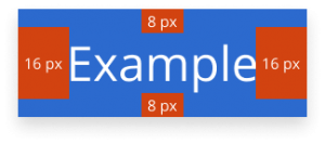
Figure 1.1 – 4-column button grid
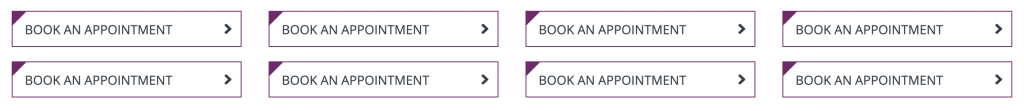
Figure 1.2 – 3-column button grid
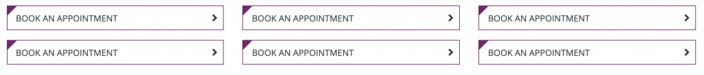
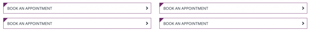
Figure 1.3 – 2-column button grid
Interaction States
- Default: Displays intended visual hierarchy and interactivity.
- Hover: Background or border darkens to indicate interactivity.
- Focus: Clear visible outline; must meet accessibility standards.
- Active: Button maintains consistent shape and gives tactile feedback.
- Disabled: Muted appearance; no hover/focus/active response.

Iconography & Illustration
- Icons are optional and should appear to the left of the button label.
- Avoid using decorative icons; use only for functional clarity.
- Do not include illustrations or images within buttons.
Responsive Behavior
- Buttons scale to container width within flexible grids.
- In multi-column layouts, buttons should reflow to full-width on mobile.
- Minimum tap target size: 48 × 48 px (per WCAG and Material guidelines).
- Maintain consistent spacing and readable text sizes across breakpoints.
Page and Component Placement Guidelines
Use buttons strategically to draw attention to important tasks.
Typical placements include:
- Top-of-page hero areas (Primary CTA)
- Within cards or teaser components (Secondary CTA)
- End-of-form or process steps (Primary CTA)
- Below grouped links or resources (List Link CTA)
Avoid using multiple primary buttons in the same section.
Button Content Guidelines
- Keep short, specific, and action-oriented.
- Use verbs that describe the outcome of the action.
- Recommended length: 1–3 words (e.g., “Get Started,” “Schedule Now,” “Find Care”).
- Avoid filler words (“Click here,” “Learn more about…”).
- Tone: Use conversational, confident, and patient-centered language consistent with UW Medicine’s voice.
Support
If you want support on the best way to organize information on a webpage, improve accessibility and user experience, or need guidance on following the website’s content and style guidelines, contact the Digital Experience team.
If you want to know the technical specifications of a component or want to know how a particular website feature works behind the scenes, visit the Component Library or contact the WebOps team.