Overview
Cards are designed to display grouped content in a consistent, visually scannable format. Each card contains a headline, short supporting text, and an optional image or icon.
Use this component to present collections of related information—such as services, articles, clinic locations, or staff contacts—within a uniform visual pattern that supports scanning and comparison.
Cards Elements
Figure 1.0 – Cards naming diagram
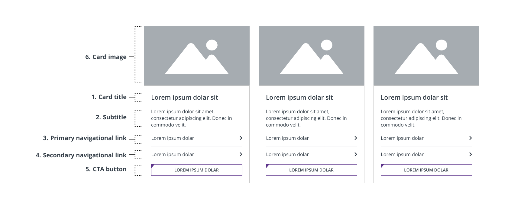
- Card title – Essential for card purpose, clarity, and accessibility. Required.
- Subtitle – Provides supporting context if the card title is unclear by itself. Optional.
- Primary navigational link – Navigates users towards an internal page. Required.
- Secondary navigational link – Use if supporting two parallel navigational choices. Optional.
- CTA button – Directs users towards immediate action. Optional.
- Card image – Visual that supports the content without overwhelming the headline. Optional.
Usage Guidelines
When to Use
- When displaying three or more related items with consistent structure
- To group content like services, clinics, specialties, or provider biographies (bios)
- To support scanning and comparison between similar offerings
When to Avoid
- For single callouts or standalone messages (use a Banner, CTA bar, or consider integrating the copy simply on the page instead)
- When information is not visually or structurally consistent across items
- If page layout does not allow enough space for clear card display
Component Types
There are four main types of cards, each with a distinct use case:
- Clinic Cards
- Story Cards
- Text Cards
- Icon Cards
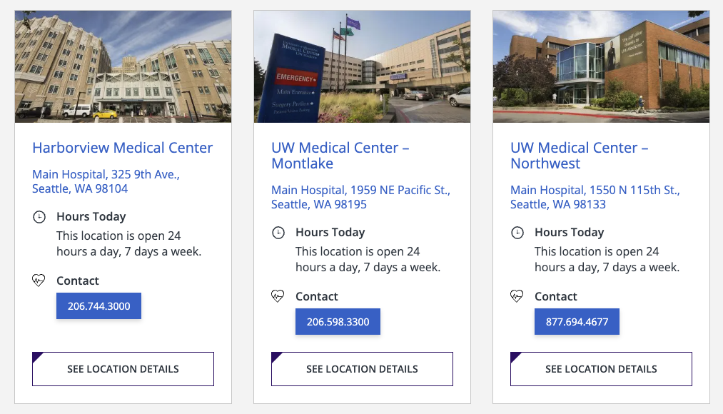
Clinic Cards
Purpose: To help users discover, understand, and access physical points of interest at a glance to identify, compare, and select locations.
Best Used: For search pages or on pages that have 3 or more locations.
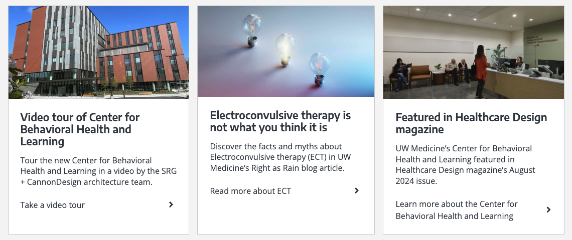
Story Cards
Purpose: To display a curated set of three stories (articles, news, features, or posts) in a card layout for quick scanning, comparison, and navigation.
Best Used: On resource pages or landing pages that help users explore two to three top stories of equal importance at a glance.
Text Cards
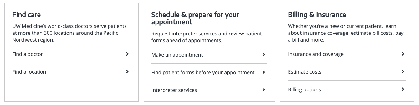
Standard Text Cards
Purpose: To highlight a set of navigational links or messages using a title, brief text, and chevron links with no image.
Best Used: On resource hubs, landing pages, or section overviews where you want to promote a group of important internal links or internal pages without imagery.
Small Emphasis Text Card
Purpose: To highlight a set of key actions and messages using a title, brief text, and a CTA button with no image.
Best Used: On resource hubs, landing pages, or section overviews where you want to promote a group of immediate actions or information without imagery.

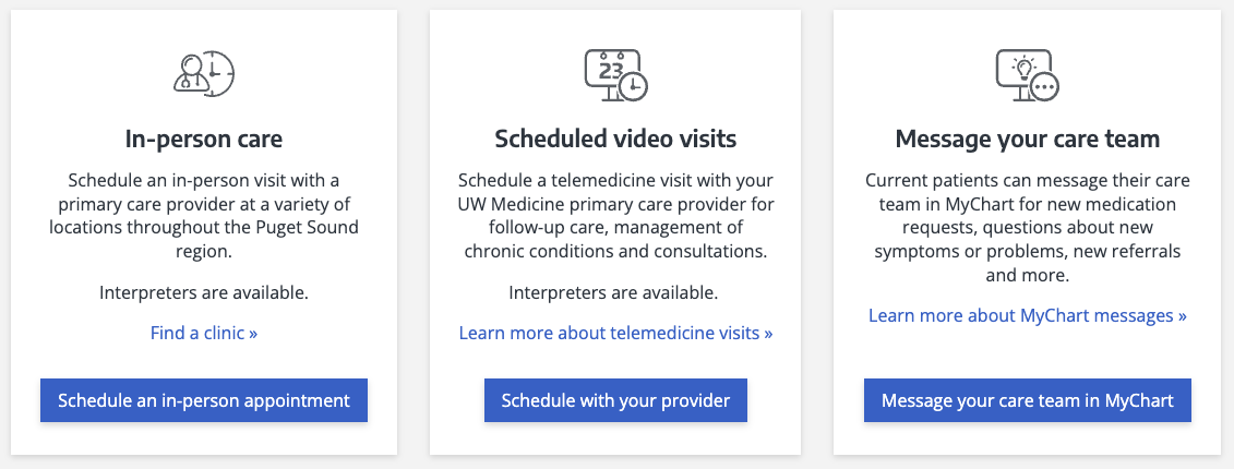
Icon Cards
Large Emphasis Icon Card
Purpose: Uses icons to represent categories or tools; good for tools, systems, and navigation.
Best Used: Where quick recognition and visual distinction of multiple options or categories are important.
Styles & Guidelines
Color & Contrast
- Background colors: White
- Text colors: Dark grey or black, depending on theme
Button & Link Styling
- CTA buttons within cards are optional. If used, they should be clearly visible
- Use clear, action-oriented text for any CTA button
Typography & Hierarchy
- Headline style:
- Sentence case, heading level H3 primarily, depending on page hierarchy.
- Length: Aim for under 60 characters (1 line on desktop)
- Supporting text (optional):
- Plain language, up to 160 characters (2–3 lines max)
- Keep consistent across cards in a set
Consistency
The use of any colors, buttons, links, and supporting text must remain consistent across all cards in a set. For example, if buttons appear on one card in a set, then buttons must appear on all cards of that set.
The same color for a button or link must also be used for all cards in a set.
Spacing & Layout
- Maintain equal padding inside cards
- Cards should align to the site grid and flex appropriately across breakpoints
Interaction States
- On hover: Card darkens slightly or adds subtle shadow
- On focus: Visible focus ring around card or CTA
Iconography & Illustration
- Icons should be consistent in style (outline or flat)
- Image or icon area must be top- and center-aligned and not overpower content
- Do not mix icons and image cards in a set
Layout
- Default layout type: Multi-column grid (2–4 columns based on screen size)
- Element alignment: Left-aligned text; top-aligned image/icon
- Content width behavior: Grid-aligned, max width of 1200px
- Spacing expectations:
- Maintain equal vertical spacing between headline, body, and CTA
- Space between cards should allow for comfortable reading and tapping
Responsive Behavior
Mobile (≤768px):
- Stack cards vertically
- Ensure tap targets are at least 44x44px
Tablet (768–1024px):
- Use 2-column layout
- Maintain clear spacing between columns
Desktop (≥1024px):
- Default to 3 or 4 columns depending on content
- All cards should maintain consistent height in a row
Page Placement Guidelines
Use this component in:
- Top of page: To highlight navigational paths or featured options
- Body of page: To present grouped services, links, or content
- Bottom of page: For related content or next steps
Content Guidelines & Character Counts
Card Title
- Purpose: Describe the service, action, or item being linked to
- Tone & Formatting: Sentence case, clear and specific Length: Up to 60 characters (1 line max)
- Examples:
- “Primary care clinics”
- “Find a specialist”
- “View billing information”
Subtitle
- Purpose: Provide short supporting detail about the headline
- Tone & Formatting: Plain language, sentence case Length: 60–160 characters (1–2 short sentences)
- Examples:
- “Schedule an appointment with your primary care provider.”
- “Learn about what to expect during your visit.”
Navigational Link (if used)
- Use link styling only if card contains multiple actions
- Use links if it’s secondary or supporting navigation that are not primary to the page’s focus. (E.g., “Read more about our team”)
CTA Button (if used)
- Use clear verbs that describe the action (“Book,” “Download,” “Subscribe”).
- Match the button text closely to the user’s intent and what happens next.
- Keep CTAs short (ideally 1-3 words).
- Be specific and avoid vague CTAs like “Click Here” or “Learn more”.
- Examples:
- “Book an Appointment”
- “Donate”
- “Sign Up”
- “Watch Video”
- “Get Support”
- “Access Resource”
- “Download PDF”
Image Guidelines & Sizes
Card images, if used, often serve as a navigational element and should match the hero image or image on the linked page.
Image size required: 800×364 px
Aspect ratio: 20:9
File type compression:
- .JPEG: Under 80 KB
- For photographs where file size reduction is key and slight quality loss is tolerated. Supports all major browsers.
- Set web quality setting of ~60-75% if manually exporting.
- .PNG: Under 100 KB
- For logos, icons, text-heavy images, or images requiring a transparent background or lossless compression. Supports all major browsers.
- Set web quality setting of PNG-8 or PNG-24 if manually exporting.
- Do not exceed 256 MB.
Do:
- Support the content without overwhelming the headline or CTA
- Use consistent photo styling across a card set
- Crop or mask images to the same dimensions
- Choose single-subject images: a location exterior, a close-up portrait, etc.
- Choose high quality images which maintain their fidelity at small scale
- Offer enough contrast between the Illustrations or graphics from the background
Don’t:
- Avoid images that contain text
- Avoid wide-angled or abstract images
- Avoid using colors outside of the UW Medicine brand colors
For UW Medicine brand photo approval process and styling, refer to UW Medicine Photography.
Support
If you want support on the best way to organize information on a webpage, improve accessibility and user experience, or need guidance on following the website’s content and style guidelines, contact the Digital Experience team.
If you want to know the technical specifications of a component or want to know how a particular website feature works behind the scenes, visit the Component Library or contact the WebOps team.