Overview
The Featured Story is designed to bring a personal, human-centered element to clinical or service-related pages. Use this component to highlight or feature impactful stories, videos, profiles, or narratives in a way that supports brand storytelling and builds trust with our patients and users.
Featured Story Elements
Figure 1.0 – Featured story naming diagram
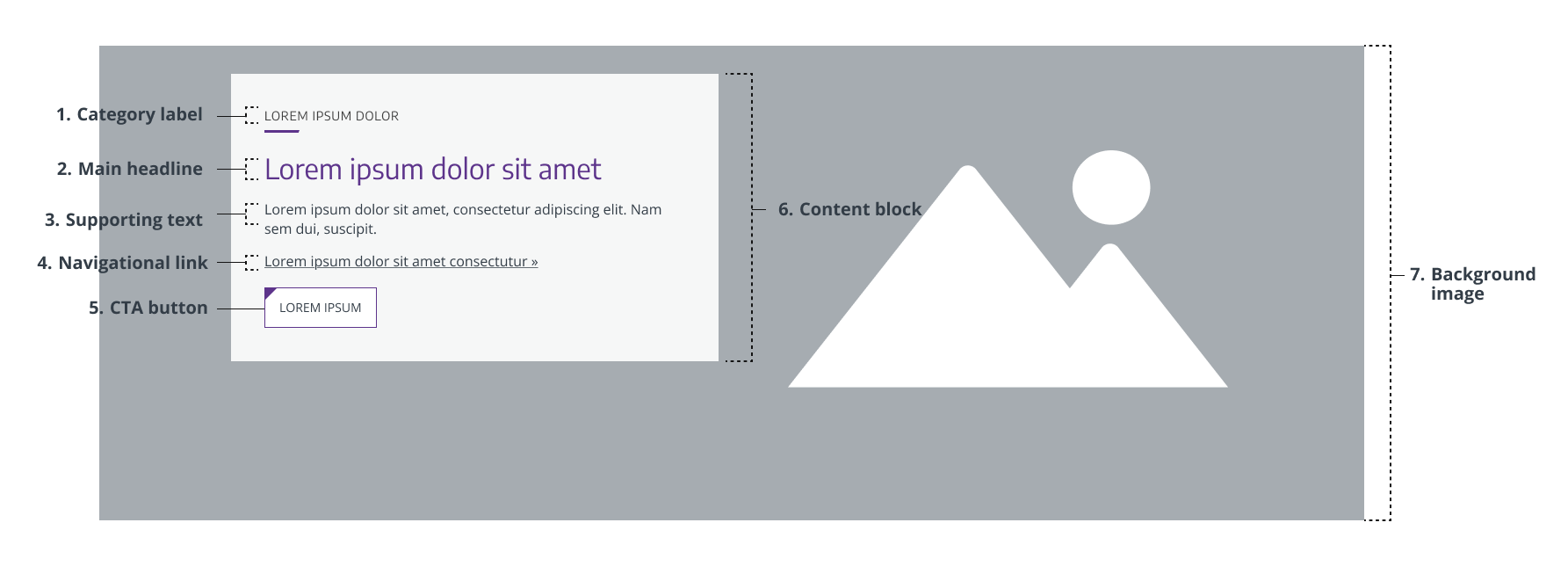
- Category label – A small visual label that adds context to the headline. Optional.
- Main headline – The section’s main heading text that provides purpose and clarity. Required.
- Supporting text – Short story summary or brief teaser description to support the headline. Required.
- Navigational link – Directs users to a different section of the website or another page on the web. Optional.
- CTA button – Directs users toward immediate action (e.g., submitting a form or opening a video popup). Optional.
- Content block – Container that includes the section’s main content. Required.
- Background image – Supports the main content with minimal distraction. Required.
Usage Guidelines
When to Use
- To highlight a featured news, story, video, achievement, patient success story, or in-depth article.
- To encourage users to explore a story or information relevant to the page topic
- To introduce video or article content tied to UW Medicine’s brand
- To visually break up content blocks on a page to avoid repetition of other components (cards, banners, etc.)
- To offer dense, educational content that would be unwieldy to include on the page the featured story appears on, but which may be of interest to a user.
When to Avoid
- Avoid when no personal story, video, or narrative is available
- Avoid when the content is transactional, data-heavy, or unrelated to people
- Avoid on pages already dense with visual or interactive content (such as other featured stories)
Component Variants
There is only one featured story component, designed for general-purpose use for webpages. However, you can choose whether or not to have the content block right- or left-aligned. A single brand-safe color may be chosen for the graphic divider, headline, and button.
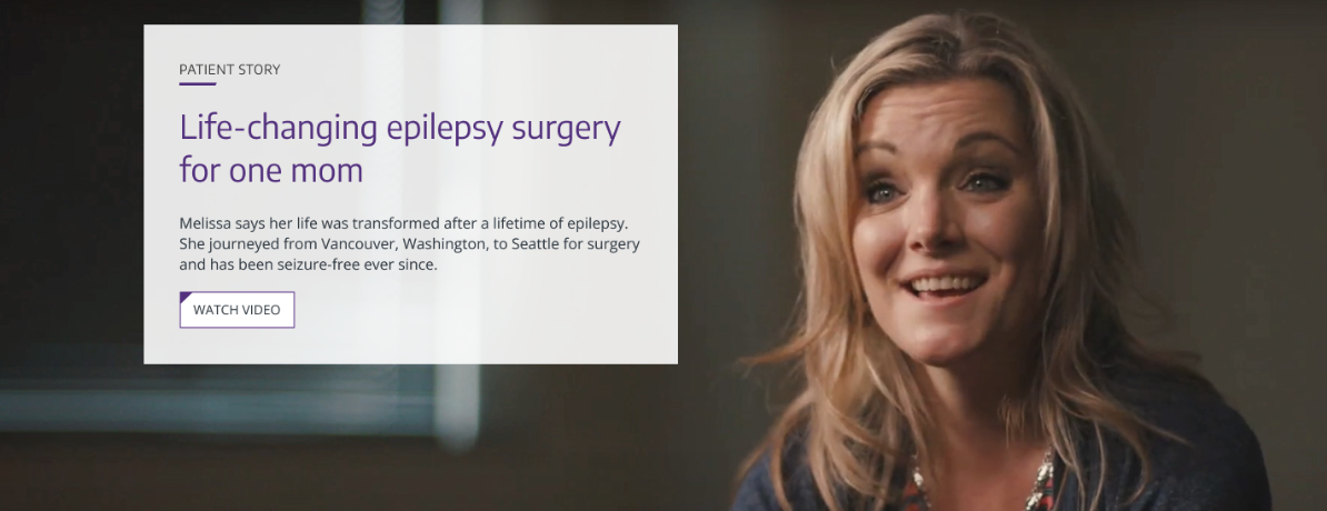
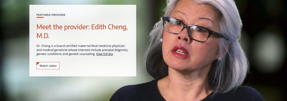
Example:
Styles & Guidelines
Color & Contrast
- Primary background for copy block: White, 90% Transparency
- Explainer and Supporting Text: Dark grey
- Graphic Divider: Branded color (must be the same color as the headline and button)
- Headline Text: Branded color (must be the same color as the graphic divider and button)
- Button: Branded color (must be the same color as the graphic divider and headline)
Typography & Hierarchy
- Headline style:
- Sentence case, heading level H2
- Length: 5–60 characters (aim for 1 line on desktop)
- Supporting text:
- Sentence case, plain language, 60–160 characters
- Use clear narrative tone to support emotional connection
CTA & Links
- Do not use full-width buttons in this component
- Avoid using multiple buttons in featured stories
Spacing & Layout
- Maintain balanced spacing between graphic divider, text, and button.
- Text and graphic divider should be right-aligned regardless of the alignment of the copy block
Interaction States
- Link styling must include hover and focus states
- When featuring a video within a featured story, always use a CTA button that opens the video in a modal (pop-up) window. This ensures viewers can watch the video in a focused, distraction-free environment.
- Embedding videos directly is not recommended, as it can clutter the layout and negatively impact page performance.
Iconography & Illustration
- Iconography is not typically used unless video is embedded as the background image (e.g., play icon)
- Play icons must be visually clear, have accessible labels, and serve to start the video player immediately.
- Pause icons must be visually clear, have accessible labels, and serve to stop the video player immediately.
Layout
- Default layout type: single column content block
- Element alignment: Right-aligned image, left-aligned copy block (can be reversed)
- Content width behavior: Grid-aligned
- Spacing expectations:
- Use consistent padding around the copy block
- Ensure clear visual separation of copy block from background content
Responsive Behavior
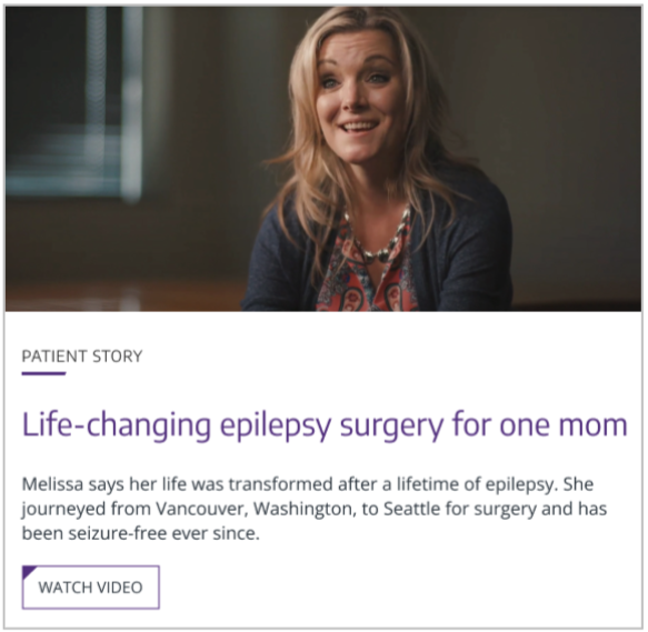
Mobile (≤768px) and Tablet (768-1042px)
- Stack elements: Image → Content Block → Category Label → Graphic Divider → Main Headline → Supporting Text → Navigational Link → Button
- Maintain padding and text legibility
Desktop (≥1024px)
Page Placement Guidelines
- Body of page: To provide narrative support for services or programs, to break up visual repetition
- Bottom of page: To feature stories and further engagement related to the page content
Content Guidelines & Character Counts
Category Label
- Purpose: Concisely explain the type of content the copy block contains
- Formatting & Tone: Extremely concise and unambiguous language
- Length: 40 characters or less
- Examples:
- “Men’s Health News”
- “Survivor Story”
Main Headline
- Purpose: Introduce the story or subject in a clear, engaging way
- Tone & Formatting: Heading level H2. Sentence case. Narrative-driven
- Length: 5–60 characters (1 line max)
- Examples:
- “A powerful tool in the battle for heart health.”
- “A new path to recovery for stroke patients.”
Supporting Text
- Purpose: Provide a short teaser or description of the story
- Tone & Formatting: Conversational, informative
- Length: 60–160 characters (1–3 sentences)
- May contain link text (“Read more about Dr. Ramirez,” “Get the full story”)
- Examples:
- “With sperm counts declining among men in the Western Hemisphere, experts who treat male reproductive health issues are concerned about pot use. Dr. Tom Walsh, a UW Medicine urologist, discusses the issue.”
- “Read how a daring helicopter rescue in remote Alaska was all possible thanks to UW Medicine’s unique approach to providing care where it’s needed the most.”
Button Text
- Keep text concise and use verb-centric language that compels a clear action (e.g., “Watch video”)
Image Guidelines & Sizes
The featured story image serves as a contextual visual backdrop to the white content block.
Image size required: 2280×920 px
Aspect ratio: 16:9
File type compression:
- .JPEG: 200-400 KB
- For photographs where file size reduction is key and slight quality loss is tolerated. Supports all major browsers.
- Set web quality setting of ~60-75% if manually exporting.
- .PNG: 400-600 KB
- For logos, icons, text-heavy images, or images requiring a transparent background or lossless compression. Supports all major browsers.
- Set web quality setting of PNG-8 or PNG-24 if manually exporting.
- Do not exceed 256 MB.
Do:
- Reinforce the subject of the story (provider, patient, research)
- Build emotional connection and visual interest
- Use high-quality, professional photos
- Reflect the subject’s personality and story
- Choose images with asymmetrical framing that leaves a large amount of negative space to one side of the subject. This makes the placement and scaling of the copy block much easier.
- Alternatively, choose a busy, wide-angle image that lacks a single clear subject that won’t be unintelligible if clipped or cropped by the copy block or resizing.
- Choose vibrant, colorful images to take advantage of the size and impact of the featured story
Don’t:
- Avoid images with busy backgrounds that compete with or distract from the content and text.
- Avoid images with obvious or heavy photo-editing; edits should be subtle and maintain an authentic look.
- Avoid staged or overly posed shots. Opt for images that feel genuine and relatable.
For UW Medicine brand photo styling and approval process, refer to the Photography Style Guide.
Support
If you want support on the best way to organize information on a webpage, improve accessibility and user experience, or need guidance on following the website’s content and style guidelines, contact the Digital Experience team.
If you want to know the technical specifications of a component or want to know how a particular website feature works behind the scenes, visit the Component Library or contact the WebOps team.