Overview
The Split-Screen Hero is designed to help users quickly understand the purpose of a page. It combines an image, brief supporting text, and call-to-action buttons to create a strong visual introduction.
Use this component to highlight key messages, introduce page content, or draw attention to a featured action within a consistent layout across uwmedicine.org.
Split-Screen Hero Elements
Figure 1.0 – Split-screen hero naming diagram
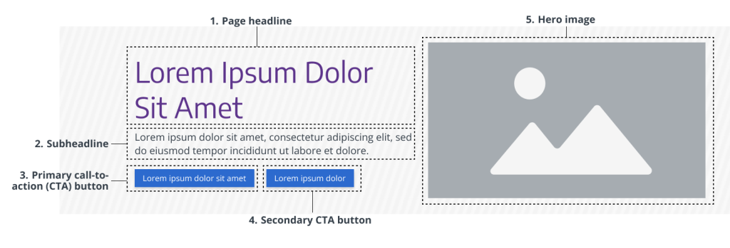
- Page headline – Essential for webpage attention, page purpose, and clarity. Required.
- Subheadline – Provides vital context to support user understanding of the page. Required.
- Primary CTA Button – Directs users toward immediate action (e.g., submitting a form or opening a popup). Required.
- Secondary CTA Button – Use if supporting two parallel actions/choices. Optional.
- Hero image – Visual identifier for the page and delivers instant impact and context to support the headline. Required.
Usage Guidelines
When to Use
- Use to introduce a page with both a text-based summary and a strong visual.
- Use when you want to guide users toward a key message or CTA (e.g. landing page, campaign page, or conversion page)
- Use when you have engaging, on-brand imagery that helps explain or strengthen the page and does not compete with your copy.
When to Avoid
- Avoid when fast, immediate communication is needed and requires no distractions for pages that are transactional or utility-focused (e.g., login pages, search, or support pages with no strong visual representation)
- Do not use when the primary message is text-driven and should take priority over imagery (e.g., service pages, blog categories page, or overview pages). Use a Text-based hero instead.
- Avoid if a strong visual is not essential, unavailable, or would distract (e.g, directory pages that list or group related pages, content-heavy pages, or more functional pages)
- Do not use if the content is too brief to warrant a dedicated hero section. Omit the hero instead (e.g., lead capture, download, login, forms, tool page). Visit Heroes to read more about when to omit a hero.
Component Variants
There is only one primary Split-screen hero, designed for general-purpose use at the top of webpages. However, you can choose whether or not to include buttons.
Purpose: Used to introduce a page with a balanced combination of image, text, and optional CTA.
Examples:
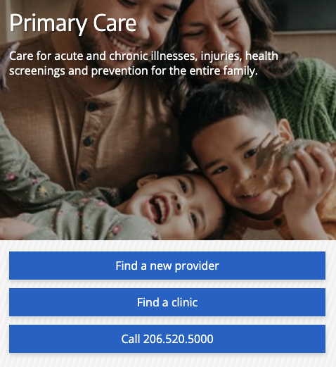
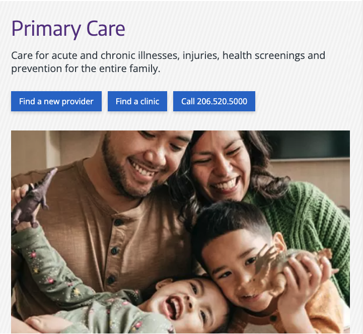
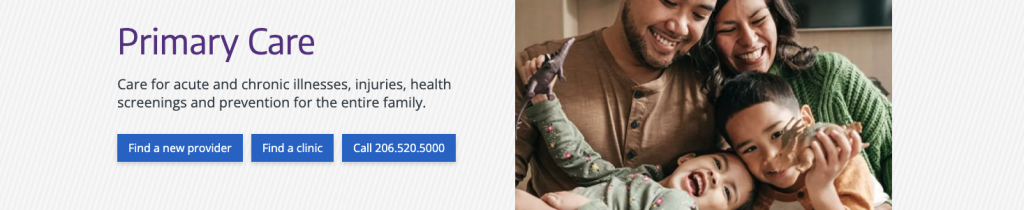
- “Cancer” page
- “Primary care” page
Styles & Guidelines
Color & Contrast
- Background colors: White, light grey, a diagonal striped pattern of white and light-grey.
- Text colors: Purple (headline), Dark grey (supporting text)
Button & Link Styling
- CTA button types: Solid blue
- Button placement: Left-aligned beneath text block
- Use only one primary CTA per instance
- Use dark colored solid buttons on light backgrounds
Spacing & Layout
Ensure visual breathing room between:
- Headline and supporting text
- Text and CTA
- Component and adjacent sections
Interaction States
- Hover: Buttons and links darken or change border to indicate interactivity
- Focus: All interactive elements must include visible focus indicators
- Active: Button maintains consistent shape and feedback on click/tap
- Disabled: Muted appearance, no hover/focus behavior
Iconography & Illustration
Icons and other illustrations are not typically used within Split-screen hero
Layout
- Default layout type: Two-column
- Element alignment: Left-aligned text, right-aligned image (reverses on mobile)
- Content width behavior: Grid-aligned, max width of 1200px
- Spacing expectations: Use spacing-md above and below; maintain 64px vertical padding
Responsive Behavior
Mobile (≤768px)
- On mobile, the image becomes the background for the headline and supporting text while CTA buttons go below the image and remain on the two-tone diagonal striped pattern.
- Stack elements in this order: Pattern → Image → Headline → Supporting text → CTA → Link
- Headline should fit within 2 lines
Tablet (768–1024px)
- On tablet, the headline, supporting text, and buttons are placed on the diagonal striped pattern above the image.
- Stack elements in this order: Pattern → Image → Headline → Supporting text → CTA → Link
Desktop (≥1024px)
- Default to two-column layout
- Maintain consistent alignment and padding across content regions
- Preserve 16:9 aspect ratio for images
Page Placement Guidelines
Use this component in the following locations when appropriate:
- Top of page: For orientation, key messaging, or high-priority CTAs
Content Guidelines & Character Count
Page Headline
- Purpose: Summarize the core message or prompt initial interest
- Formatting & Tone: Heading level H1. Sentence case. Clear, concise, and aligned with UW Medicine’s brand tone and voice
- Length: 5–99 characters with spaces (aim for one line on desktop)
- Avoid: Overly broad statements, run-on phrases, or excessive punctuation
- Examples:
- “Manage your care with one login”
- “Find a doctor who understands your needs”
Subheadline
- Purpose: Provide supporting detail that clarifies the message or next step
- Tone & Formatting: Sentence case. One to two concise sentences
- Length: 39–239 characters with spaces (aim for 2–5 lines on desktop, 6 or fewer on mobile)
- Avoid: Repeating the headline or CTA. Keep it focused and conversational.
- Examples:
- “Our clinics offer same-day and next-day appointments across the region.”
- “Log in to MyChart to see test results, message your provider, or manage your appointments.”
Action Element (CTA Button)
- Use only when a key action is present and the page goal is clear.
- Keep text concise and use clear, action-oriented verbs.
- Examples:
- “Schedule now”
- “Get started”
- “Find a provider”
Navigational Link
Include only if necessary. Place below the CTA and keep link text descriptive.
Image Guidelines & Sizes
The split-screen hero image will serve as the page’s visual identifier and be a navigation wayfinding element that would be crosslinked and referenced from other pages.
Image size required: 992×388 px
Aspect ratio: 248:97
File type compression:
- .JPEG: Under 150 KB
- For photographs where file size reduction is key and slight quality loss is tolerated. Supports all major browsers.
- Set web quality setting of ~60-75% if manually exporting.
- .PNG: Under 120 KB
- For logos, icons, text-heavy images, or images requiring a transparent background or lossless compression. Supports all major browsers.
- Set web quality setting of PNG-8 or PNG-24 if manually exporting.
- Do not exceed 256 MB.
Do:
- Use high-contrast, vibrant images
- Ensure the tone and subject of the image is relevant to the page’s content
- Choose an informational image that infers the page’s intent to the user over something “flashy,” generic, or intended to evoke an emotional response
- Use colors in imagery strategically
- Bold/saturated images for visual emphasis
- Neutral/muted imagery for general content
Don’t:
- Avoid images that aren’t essential to understanding, as part of the image may be cropped or obscured
For UW Medicine brand photo approval process and styling, refer to the UW Medicine Photography.
Support
If you want support on the best way to organize information on a webpage, improve accessibility and user experience, or need guidance on following the website’s content and style guidelines, contact the Digital Experience team.
If you want a custom illustration, help with photo choices, or want to check that your graphics match the UW Medicine brand, contact the Content & Brand Services team.
If you want to know the technical specifications of a component or want to know how a particular website feature works behind the scenes, visit the Component Library or contact the WebOps team.