UW Medicine uses the same shade of purple as the University of Washington, taking advantage of the strong UW brand equity. A modern gradient treatment is also available, which helps add life, movement and energy to our header, footer and color blocks.
Our secondary palette complements our primary colors, adding flexibility to our communications and also offering a more modern and friendly feel through a variety of hues.
Primary colors

PMS 2685 C
HEX #32006e
CMYK 93,100,18,21
RGB 50,0,110

PMS 7408 C
HEX #FFC700
CMYK 0,22,100,0
RGB 255,199,0
Primary palette
PMS 2685 C
HEX #32006e
CMYK 93,100,18,21
RGB 50,0,110

HEX #5d348b
CMYK 79,96,6,1
RGB 93,52,139

HEX #8663a8
CMYK 53,69,1,0
RGB 134,99,168

HEX #ae95c4
CMYK 32,43,1,0
RGB 174,149,196

HEX #d6c8e1
CMYK 14,20,1,0
RGB 214,200,225
PMS 7408 C
HEX #FFC700
CMYK 0,22,100,0
RGB 255,199,0

HEX #ffd233
CMYK 0,16,89,0
RGB 255,210,51

HEX #ffdd66
CMYK 1,11,72,0
RGB 255,221,102

HEX #ffe999
CMYK 1,6,48,0
RGB 255,233,153

HEX #fff4cc
CMYK 0,2,23,0
RGB 255,244,204
Secondary palette

PMS 432 C
HEX #333d47
CMYK 78,64,53,44
RGB 51,61,71

HEX #566069
CMYK 68,54,46,21
RGB 86,96,105

HEX #7d858c
CMYK 54,41,37,5
RGB 125,133,140

HEX #a6acb1
CMYK 36,26,25,0
RGB 166,172,177

HEX #d1d4d7
CMYK 17,12,11,0
RGB 209,212,215

PMS 428 C
HEX #c3c5c8
CMYK 23,17,17,0
RGB 195,197,200

HEX #cdd0d3
CMYK 18,13,12,0
RGB 205,208,211

HEX #d9dbdd
CMYK 14,9,9,0
RGB 217,219,221

HEX #e5e7e8
CMYK 9,6,6,0
RGB 229,231,232

HEX #f5f5f5
CMYK 4,2,2,0
RGB 245,245,245

PMS 255 C
HEX #76236C
CMYK 61,100,25,10
RGB 118,35,108

HEX #925088
CMYK 48,81,18,2
RGB 146,80,136

HEX #ae7aa4
CMYK 33,59,13,0
RGB 174,122,164

HEX #c9a5c2
CMYK 20,37,7,0
RGB 201,165,194

HEX #e3d1df
CMYK 9,17,3,0
RGB 227,209,223

PMS 2728 U
HEX #2C6ACE
CMYK 82,60,0,0
RGB 44,106,206

HEX #5688d8
CMYK 67,42,0,0
RGB 86,136,216

HEX #81a5e2
CMYK 48,28,0,0
RGB 129,165,226

HEX #abc3eb
CMYK 31,16,0,0
RGB 171,195,235

HEX #d5e1f5
CMYK 14,7,0,0
RGB 213,225,245

PMS 158 C
HEX #D24310
CMYK 12,87,100,3
RGB 210,67,16

HEX #db6940
CMYK 10,71,83,1
RGB 219,105,64

HEX #e48e70
CMYK 8,53,56,0
RGB 228,142,112

HEX #edb49f
CMYK 5,33,33,0
RGB 237,180,159

HEX #f6d9cf
CMYK 2,16,14,0
RGB 246,217,207

PMS 7713 U
HEX #008995
CMYK 84,29,38,3
RGB 0,137,149

HEX #33a1aa
CMYK 74,18,33,0
RGB 51,161,170

HEX #66b8c0
CMYK 58,9,24,0
RGB 102,184,192

HEX #99d0d5
CMYK 39,3,16,0
RGB 153,208,213

HEX #cce7ea
CMYK 19,1,7,0
RGB 204,231,234
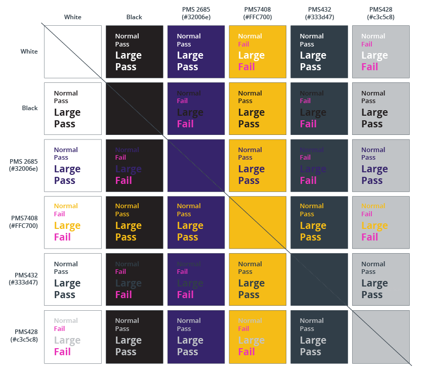
American Disabilities Act (ADA) web color compliance
The American Disabilities Act (ADA) standards must be followed and will dictate color contrast choices. When paired together, not every color in the primary and secondary palettes will meet the Web Content Accessibility Guidelines 2.0. We encourage you to check your color combinations with the links below:
• Color contrast needs to meet WCAG 2.0 compliance, with Level AA:
http://www.washington.edu/accessibility/web/color
• Full guidelines can be found at:
http://www.washington.edu/accessibility
Accent Colors
Consistent application of color strengthens our brand and ensures clarity in every message. Accent colors should be used thoughtfully and remain in proportion, supporting rather than overwhelming our primary colors of purple and gold. Importantly, red is designated for alerts or emergency messaging. Its strategic use draws immediate attention to urgent information, preserving its impact within our system. By balancing primary and secondary colors as outlined, we create visual harmony for our brand.

Additional assets
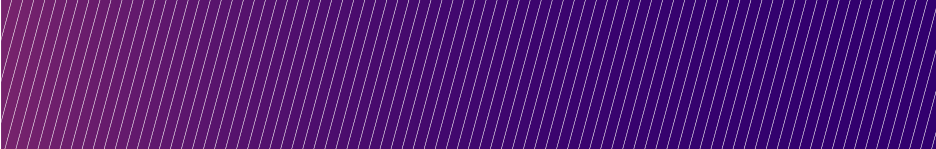
Linear Gradient

This linear gradient can be used for header, footer and color blocks and is a mixture of the primary UW Medicine purple, PMS 2685 (HEX #32006e), and the secondary purple, PMS 255 (HEX #76236C). To achieve this gradient swatch, the Pantone colors must be converted from spot to process to avoid a gray tone between the colors as they mix. The color break between the two colors should start roughly at a 3:1 ratio in favor of the primary purple.
The UW Medicine logo can only rest within the primary purple, so you may need to adjust the gradient as needed to ensure that the logo is placed properly within the gradient color.
Angled Rain
A repeating pattern of 15-degree lines creates the angled background texture. Use this to accent your brand designs. Keep minimal contrast between the texture and your background — this element should be subtle.
The artwork for this graphic is available at the UW Brand site.