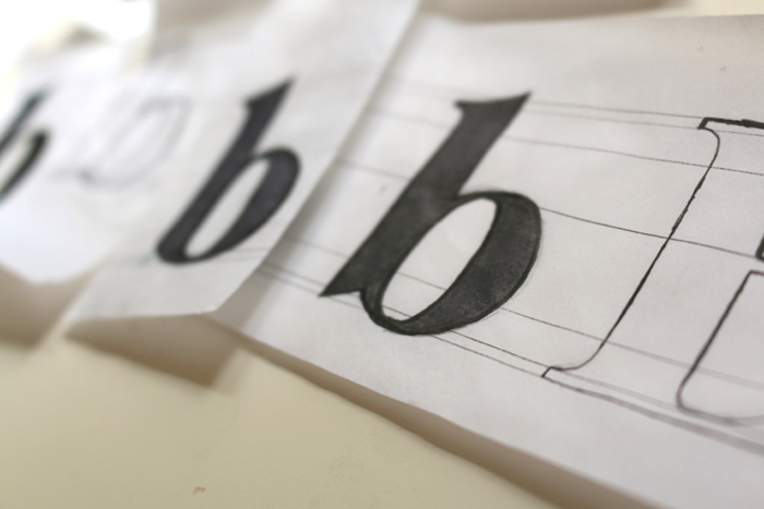
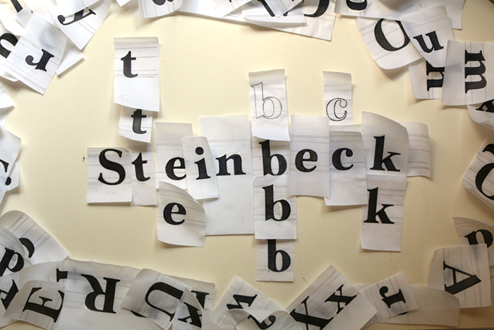
Steinbeck
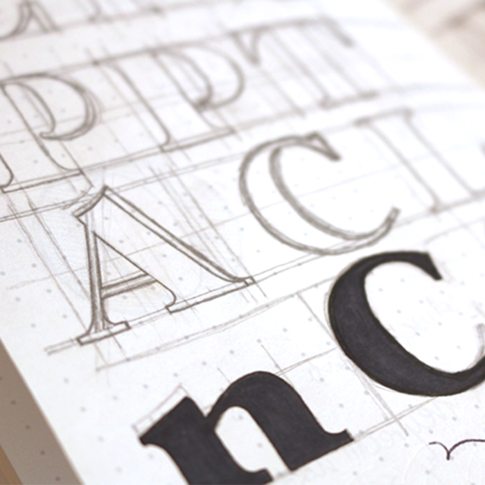
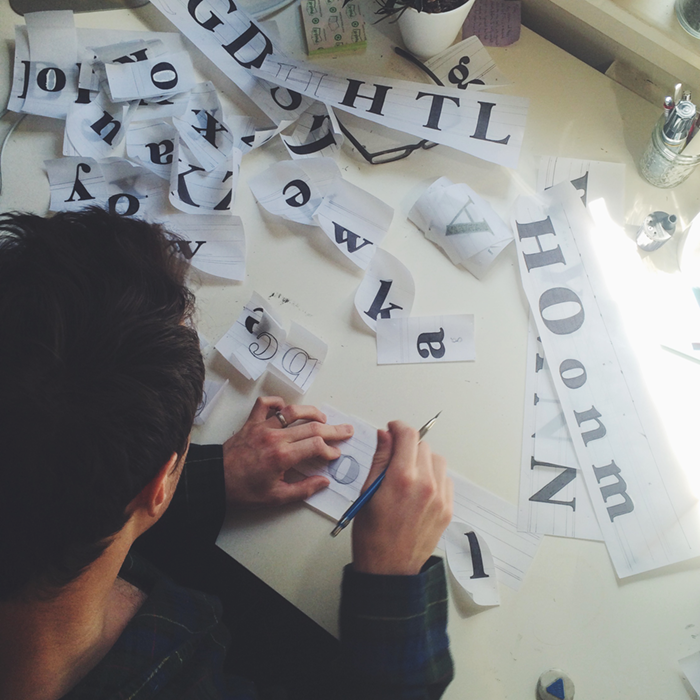
Born out of love for the famous author’s novels, Steinbeck is a display-face inspired by transitional and modern fonts such as Baskerville and Surveyor. Steinbeck intends to embody the class that was the person, and embody the magnificent personality and color of the mind behind the writing. A combination of a wide “o” and rounded lowercase terminals make a bubbly appearance to the reader, while sharp ascenders and balanced widths carry the author’s somewhat stubborn personality.With heavily contrasted thicks and thins, and steady, predictable curves, this typeface is intended for headlines, titles, and other large formats.
Designer
Mahlon Houk
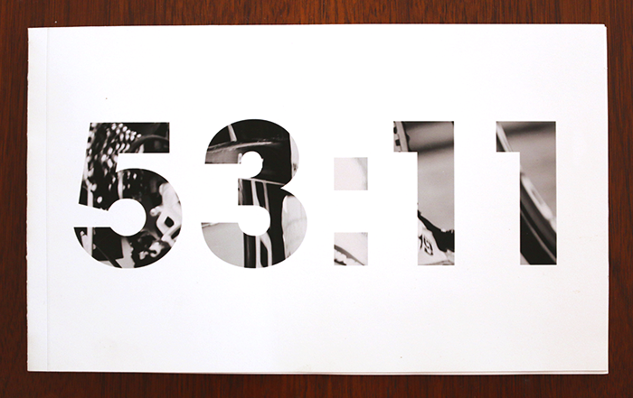
53:11
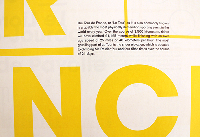
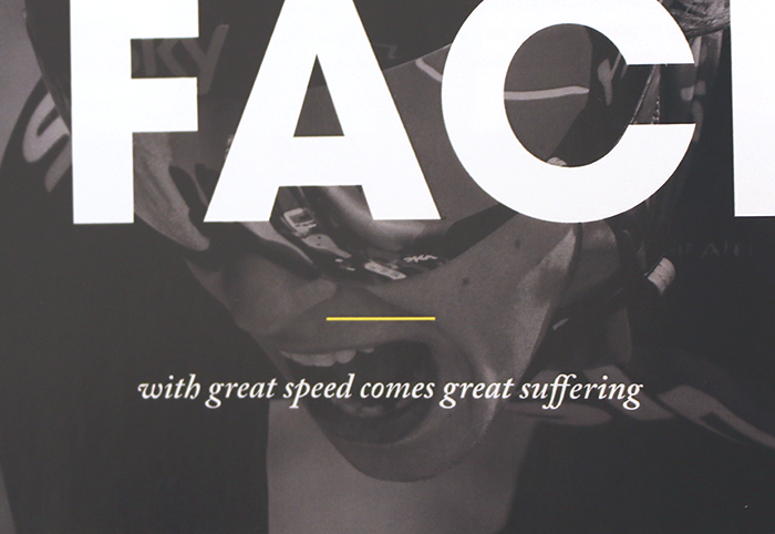
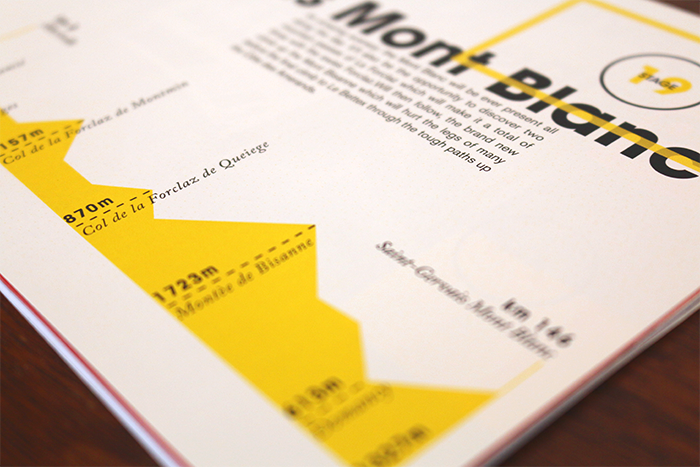
53:11 is a bi-annual publication aimed to interest those who are unfamiliar with European professional cycling and cycling culture, as well as please those who are already dedicated to the sport. 53:11 maintains a classic feel, while leaning columns of type and powerful photography give a sense of speed and risk.
The publication features stories, tips, a photo collage, and information regarding the best stages of the 2016 Tour de France to watch.
Photography graciously provided by Mike Hone and Yee Feng.
Designer
Mahlon Houk