Lock & Lock
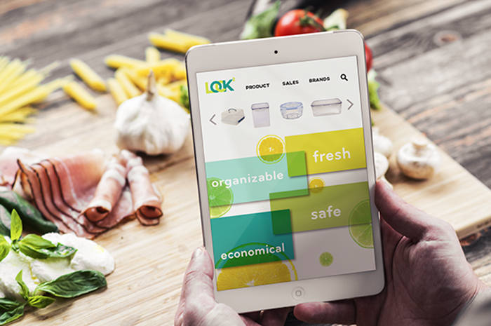
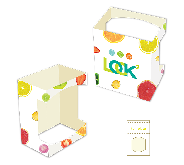
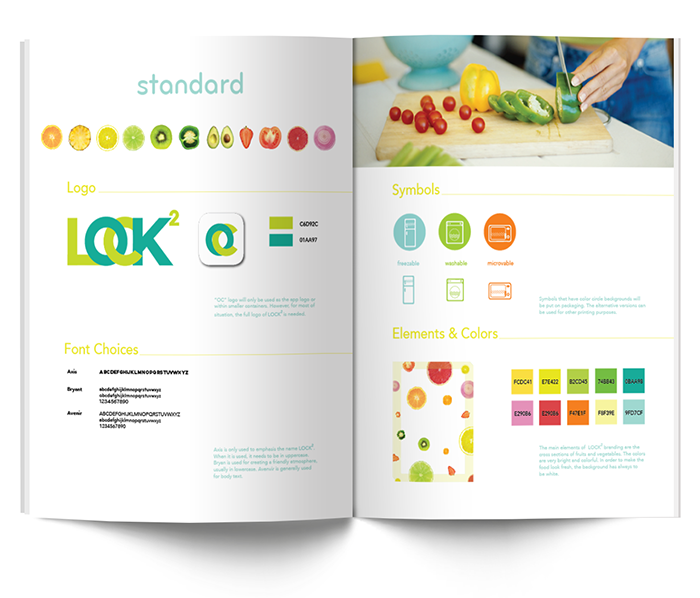
A project of rebranding Lock & Lock to strengthen the brand image to consumers. The design conveys the idea of freshness, safety and healthy. The new logo has the same meaning as LOCK & LOCK. However, it is more powerful, easy and convenient. Some symbols are used as stickers on the container and packaging to show the container’s functions to the user. Redesigned webpage to keep a consistent brand image reaching to customers. Buyers can also purchase products through different categories based on their different needs. Last but not least, Lock & Lock APP is introduced to the user to prevent food waste, because it will track the freshness of their food, and remind them to finish the food before it gets bad.
Designer
Yating Zhuang