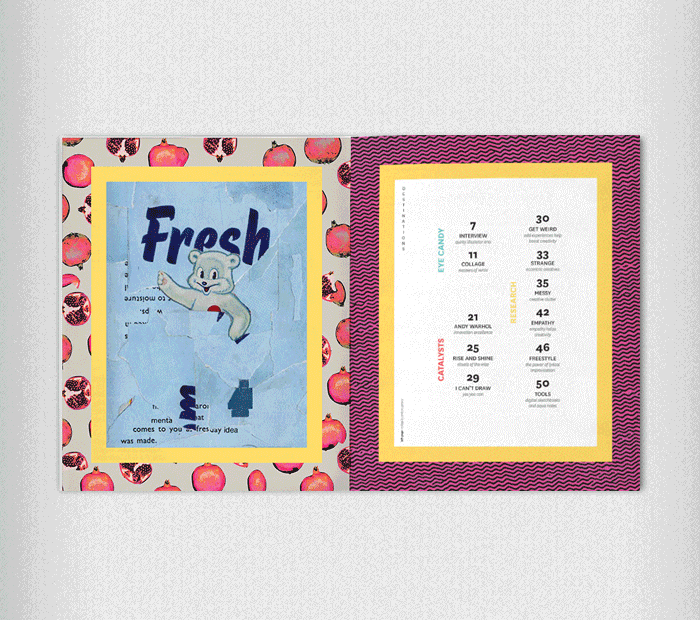
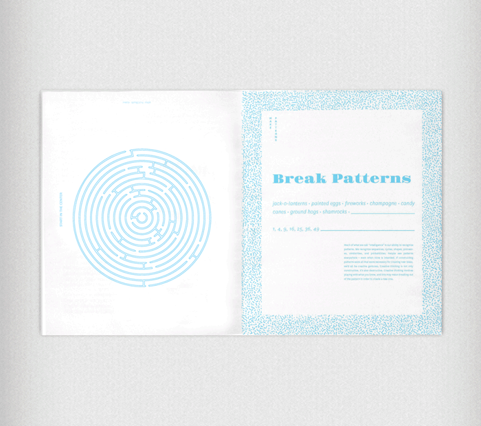
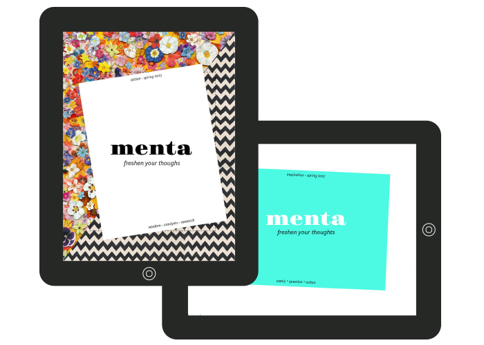
Menta Magazine
Menta means mint. This publication is meant for artists or anyone who struggles with creative process. Its goal is to inspire creative thought and action. The first half is filled with interviews, eye candy, neuroscience and latest research information. Midway through, the interactive flip side is structured like a workbook, filled with questions, activities and challenges. The interactive portion forces the reader to change their perspective and flip the publication upside down to get busy with the creative process by providing stimulating activities proven to boost creativity. A single color and ample white space in interactive portion invite the reader to let their creativity spill onto the pages. The digital publication provides the same two-sided experiences as the reader changes from horizontal to vertical orientation.
Designer
Lacey Verhalen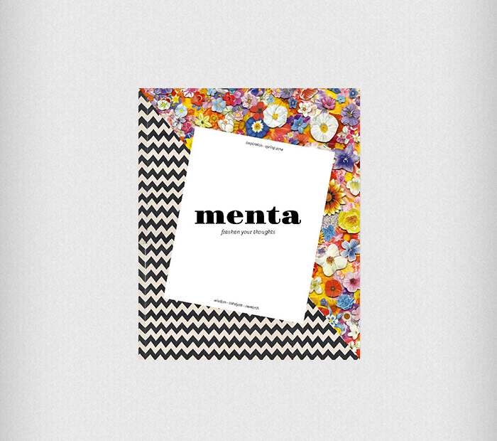
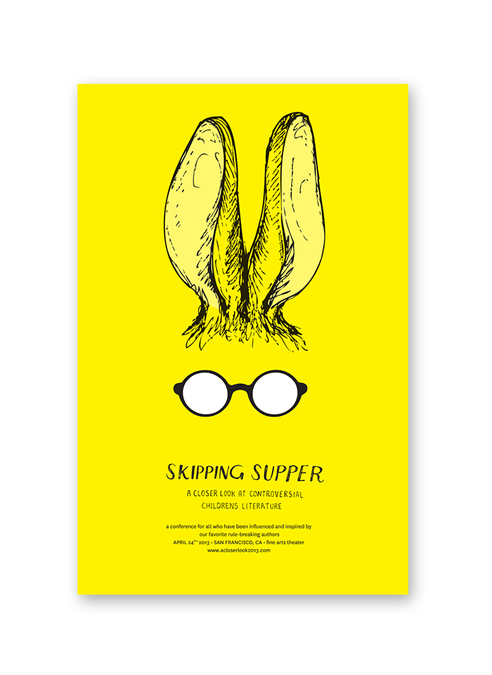
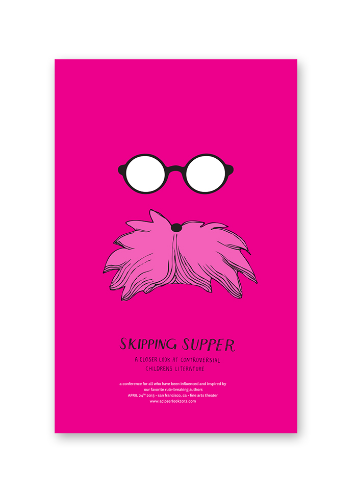
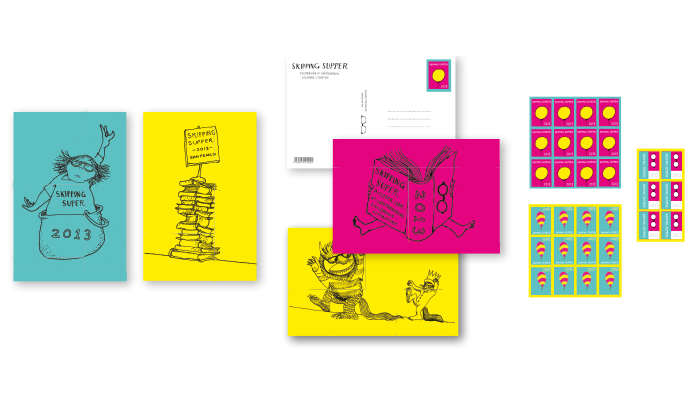
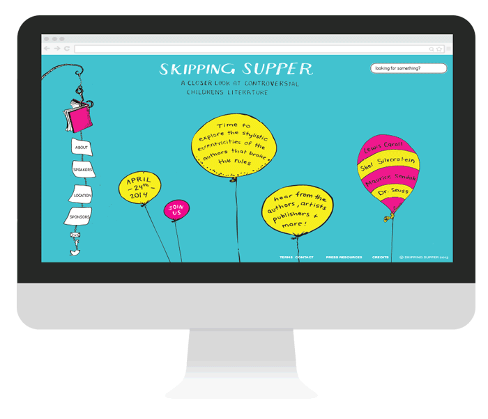
Skipping Supper
This identity was done for a fictional conference on controversial children’s literature. The neon colors are meant to emulate the shock of subversion authors like Sendak, Silverstein, and Seuss brought to their genre. The minimalism of the illustrations was inspired by the monastic simplicity of these influential authors. The branding of this conference encourages the audience to take a closer look at the authors who celebrated children that broke the rules, even at the risk of skipping supper.
Designer
Lacey Verhalen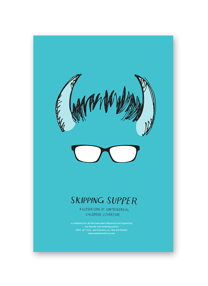
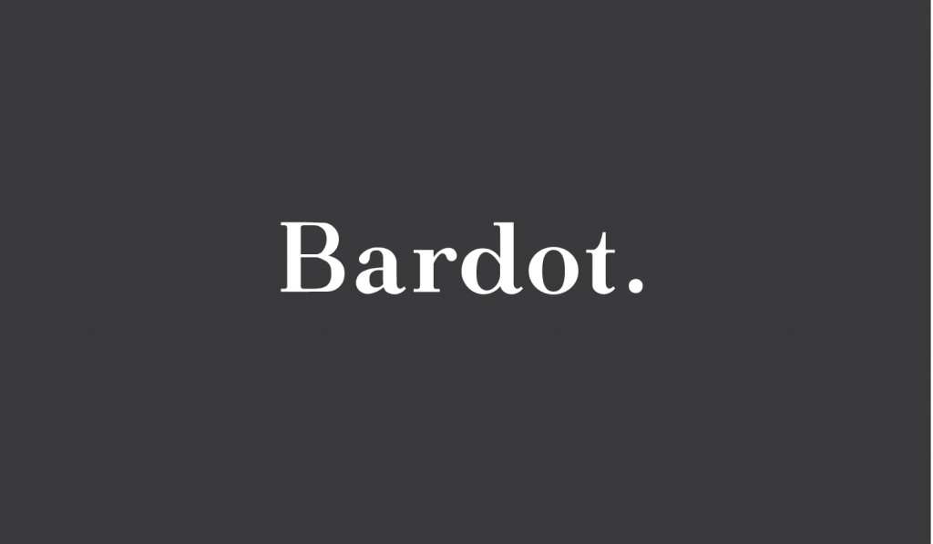
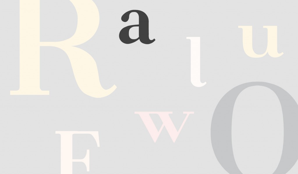
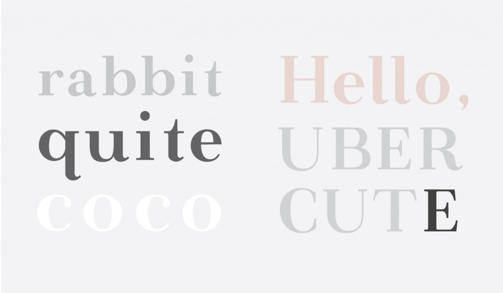
Bardot
Bardot is a chic and cheeky neoclassical serif typeface that drew inspiration from the benchmark Didone family, but with a bit of added sass. Bardot is energized but unhurried and in control. This wide and curvy typeface is ideal for display. Bardot maintains a smooth horizontal rhythm with a bit of a kick. The smooth brackets and curves of this font make for a pretty, light-hearted interpretation of the natural and elegant typefaces from which it was inspired.
Team Members