Originally posted on June 27, 2021 at https://fanfictiondatascience.tumblr.com/post/655156632325701632/how-i-tracked-down-a-peculiar-problem-in-a-fanfic.
Every review on fanfiction.net has an associated timestamp telling us exactly when it was posted, or so we thought. When trying to find the hours of peak review activity across different fanfiction.net fandoms, I saw some fandoms with very uneven review count distributions (shown below).
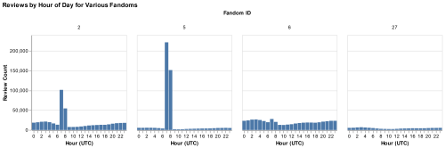
What made this even more confusing was that some of the fandoms had much more pronounced spikes at 7 and 8 UTC. I compared the fandoms with large spikes to those without. I noticed that ones with spikes tended to be fandoms with many reviews in the early 2000s. I wanted to look at how the distribution of review time changed over each year. I chose to make a heat map of the average daily distribution by year. I did some data wrangling so that I could put year on the Y axis and hour of review on the X- axis. Below is the result.
First Exploratory Visualization:
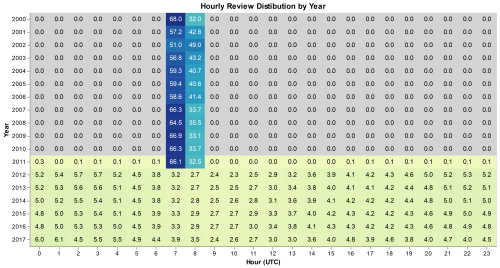
The resulting visualization made the situation much clearer. Every year should look like the ones between 2012 and 2017, where reviews are relatively evenly spread across the day with small variations at peak hours. Before 2012 we see very different behavior. Around 60% of reviews have a time stamp of 7 UTC, and the other 40% have a timestamp with 8 UTC. We see absolutely no reviews with timestamps for other hours. 2011 is a unique case where we have almost all reviews posted during the 7-8 UTC with less than 1% posted at other hours. To get a closer look at 2011, I filtered the data to just 2011 and used months instead of years on the Y-axis.
Second Exploratory Visualization:
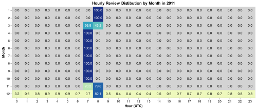
This graph reveals two important clues as to what is wrong with the dataset. The first is what the split between 7 and 8 values is from. 7 and 8 values each have a specific time of year where they are the only review time, switching in March and November. I realized that something else important happens with dates in March and November, daylight-savings time. I looked up the daylight-saving times for 2011 and it was from March 14th to November 6th we see those dates reflected exactly in the data. We even see that March is evenly split because the 14th is close to the middle of the month. In November the 6th is close to the beginning so we see an uneven split. The other thing that this graph shows us is that at some point in December the dates started to match the expected values. To get the most accurate value of the date that this happened I had to switch to looking at the day instead of month, and found that on December 27th all dates are 0 UTC and then after that they seem to be accurate to the minute.
Now that I had the issue clearly defined, I had to figure out why this was an issue in our data in the first place, and hopefully fix it. Instead of exploring our collected data, I saved a lot of time by going right to the source. I went on fanfiction.net, found some old reviews, inspected the webpage to find the UTC time stamp, and converted the timestamps into datetimes. I found that all the old reviews on the site were either 7 or 8 pm. I wasn’t able to find an exact reason that the site is inaccurate, but I believe that when the ff.net backend was built in 2000 they decided to save some hard drive space by only saving dates by the day.
Here
is 2015, a typical year, showing what the review distribution should
look like. We can see people reviewing later in the day during summer
and winter break. 8 UTC is midnight Pacific and 3 am Eastern, we see the
lowest usage during the three following hours when many of the US
reviewers are sleeping.
While creating these visualisations I learned:
1. Visualise
both before and after processing data. Before calculating the month
from the date, the visualisations didn’t discover the inaccuracies.
After splitting date into the year and hour of the day variables, the
visualisations showed the problems with the dates.
2. Look
deeper if something seems weird. When I first saw the problem by
accident I almost dismissed it. Going off on a tangent ended up making a
discovery that will be helpful for future research with this dataset.
3. Creating
a presentation can help with findings. When creating a presentation to
the group I built an interactive version of the graph (linked below).
The interactive version showed that the data was missing a lot of
reviews from when we were scraping the site in late 2016 to early 2017,
another important thing to know when using this dataset.
You can see the code to create the visualizations here: https://travisneils.github.io/dates/dates_vis.html
You can find an interactive version here: https://travisneils.github.io/dates/date_chart.html
