Originally posted on December 13, 2020 at https://fanfictiondatascience.tumblr.com/post/637428500969717760/how-to-get-more-reviews-a-data-analysis.
A time-shifted serial correlation analysis of reviewing and being reviewed.
Acknowledgements: Investigation by Arthur Liu with thanks to Dr. Cecilia Aragon and Jenna Frens for feedback and editing and also to team lead Niamh Froelich.
Is it true that giving someone a review will make that person more likely to write reviews as well? Conversely, is it true instead that writing more reviews yourself will help you get more reviews from others?
In this post, we explore one avenue of reciprocity by analyzing the time series of reviews given vs. reviews received.
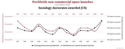
Of course, you have to be careful with this technique. The inspiration of the analysis we utilized comes partly from Tyler Vigen’s Spurious Correlations site (http://www.tylervigen.com/spurious-correlations) where he shows interesting correlations between clearly unrelated events. With a humorous perspective, he reminds us that correlation is not evidence of causation (since sociology doctorates and rocket launches are totally coincidental), but the analysis techniques here are an interesting technique to investigate potential relationships between two different time series.
Back to our topic of reciprocity, we wanted to investigate the relationship between reviews given and reviews received. We had two hypotheses that we were interested in testing: first, we were curious if users who received more reviews would be more inclined to give reviews themselves. Second, we were curious if giving reviews would help increase the number of reviews you personally received.
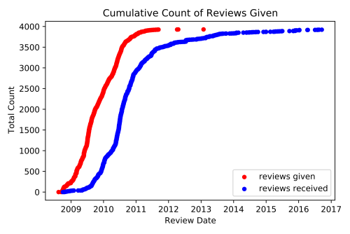
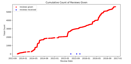
To get into specifics, here is an example plot of a real user’s review activity.

Let’s break it down. This plot follows the activity of a single user over the course of several years. It plots the total amount of reviews that they gave (in red) and also the total number of reviews that they had received on their fan fictions (in blue). What this chart shows us is that this is a user who has had a very consistent amount of activity in terms of giving out reviews. It also captures spikes in the number of reviews received (blue) which may correspond to having released a new chapter.
If there was a strong link between reviews given and reviews received in either direction, we would expect to see that increases in one is followed by increases in the other. Here is an example where we witness such a relationship:
Since it is harder to analyze the change in activity level from these cumulative plots, we then looked at the total number of reviews given each month. Here’s what that looks like for the same person:
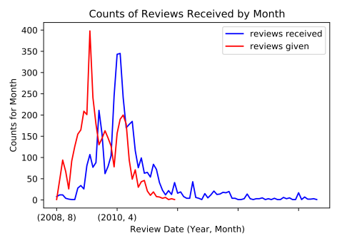
This time, it is more apparent that there is a similar pattern in the activity behavior for the reviews given and reviews received. For this example, that similarity is a similar spiking pattern.
From Vigen’s website, we could naively apply a correlation calculation here, but there is a glaring flaw: one of the time series is clearly ahead of the other. So, what if we just shifted one of the time series so they overlapped and then computed the correlation? This is the basic intuition of serial correlation: we apply a range of possible shifts and then compute the correlation between these shifted graphs. The one with the highest correlation would be the one with the best match.
The results for different shifts:

The best shift of “11 frames”:
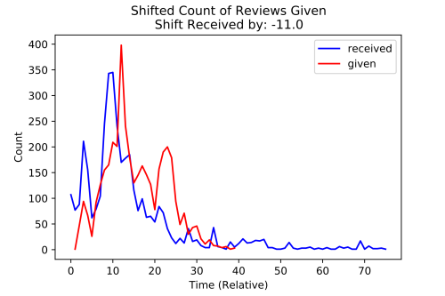
In other words, for this person, giving a lot of reviews correlates well with receiving a lot of reviews roughly 11 months later. Of course, this doesn’t prove any sort of causation, but we can speculate that the increased amount of reviews this user gave helped boost the amount of reviews they got later!
From this analysis of an individual person, we were curious how this extended to the larger community to see if these same trends existed! The short answer, “eh, not really,” but it is interesting to see why this cool pattern might not generalize adequately.
1. Not all individuals get reviews and give reviews at the same scale
Some users just like to give reviews and some users just like to write reviews!
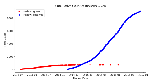
For instance, here is someone who gives a lot of reviews and didn’t get many themselves.
Here is someone who gave some reviews, but then focused on writing stories and received a lot more reviews instead!
For graphs like these, it is hard to apply the analysis we did earlier because the relationship is likely a lot weaker or there might just not be enough data points to capture it anyway.
We can summarize these examples for the overall population by looking at the ratio between reviews given to reviews received.
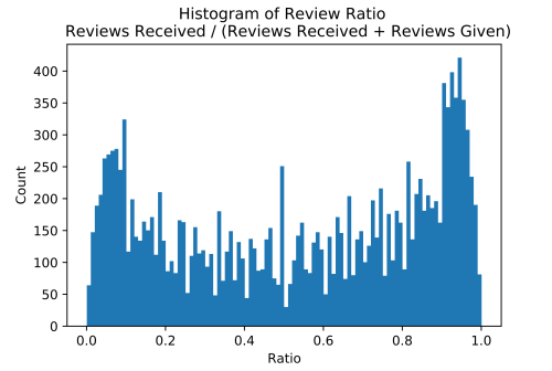
For this sample of 10k users, we see that those who primarily receive reviews will have a larger ratio (right), and users who primarily give reviews will have a smaller ratio (left). In more detail, a ratio of 1.0 means that they only received reviews. For example: 10 reviews received / (10 reviews received + 0 reviews given) = 1. For a ratio of 0.0, it means they received no reviews. For each ratio, the graph shows the total count of the 10k users who had that ratio.
To address issue (1), we reduced the scope down to users who had a relatively equal ratio of reviews given vs. reviews received.
Additionally, we pruned for users who had received at least 10 reviews. This way, we would have enough data points to use for our analysis. In fact, this is also why there is a large spike in the 0.5 ratio which consisted of a lot of users who had written one or two reviews and received an equal amount.
With this cleaned up, we also computed the lags on a finer scale–weeks–instead of months since we noticed that months were not granular enough. We computed the most common lags, and here is a plot of the results. This lag is the shift applied to received reviews, and the correlation is how well the two series correlated with each other after the shift. A correlation of 1 means that as one increased, the other increased as well, a correlation of -1 means that as one decreased, the other increased, and smaller values such as 0.8 mean that the correlation was positive, but less strong.

So the result here is both a little messier and structured than we had hoped from our hypothesis, but that’s part of the research process!
To elaborate, in the X dimension, the lag, there isn’t a particular range that was significantly denser than the rest. In fact, if we looked at the histogram, we see something like this:
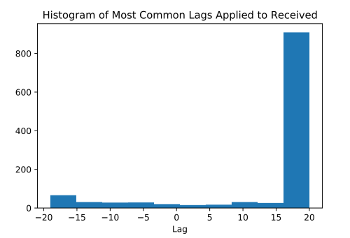
So we lied a little, it looks like that last lag of +20 weeks looks really popular, but this is actually an artifact caused by the serial correlation process. If you recall this graph:
The red line is the chosen lag at the peak. In this case, the shifting actually peaked, but if we had truncated the graph at 5, it would have simply picked that highest shift.
Not convinced? Here’s the same analytics, but now we calculated up to a lag of 40.
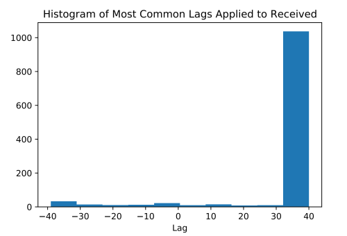
Looks like the 20 bucket wasn’t particularly special after all.
So ignoring this last bucket (and the first bucket for a similar reason), we notice that our histogram matches this noisiness that we observed for the lags.

What does this mean? It suggests that there is no general pattern that can succinctly summarize the larger population, and that we are unable to conclude that there is a common average positive or negative lag relationship between the number of reviews someone has given and the number of reviews that they have received. Some authors sent more reviews after receiving more reviews (positive lags), some authors received more reviews after getting reviews (negative lags), and some authors did not exhibit much of a relationship either way (the first and last buckets which didn’t find a reasonable shift). Although these relationships do exist, the timing was not consistent overall so we can’t say anything about fanfiction.net authors in general.
So…
2. Looking across users, we do not see consistent behavior in a time-shifted relationship between a person’s received and given review count
Even when we look at the lags with the highest correlation (r > 0.7), we see that this even distribution of lags still holds.

In summary, this isn’t the dead end! (With research, it rarely is!) But it helps paint a better picture of the users in the community and why this approach may not be well suited to encapsulate it well. We see that the relationship between reviews received and given doesn’t follow a necessarily time-shifted relationship and that in fact, this shift can go either direction. Try taking a look at your own reviewing trends, and see where you would be located within these graphs! Are you someone who has a positive shift or a negative time shift… or no strong correlation at all?
In the meanwhile, we’re still exploring some other interesting approaches in reciprocity! Stay tuned :)
