Overview
An alert is a temporary notification designed to quickly inform users of critical, time-sensitive information and prompt actionable responses. Alerts are used for urgent updates affecting patient care, operational changes, or public health communications.
Alerts can be dismissible or non-dismissible. In either case, since Alerts are temporary, they should be removed once the information is no longer relevant. Overuse of alerts can cause alert fatigue, diminishing their effectiveness.
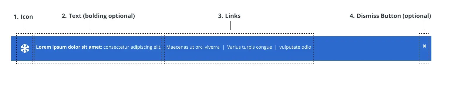
Figure 1.0 – Alert naming diagram
Alert Planning & Submission
Emergency Alert
If an alert must be added to the website immediately due to an emergency, contact the following people:
- Primary – Bruce: text then call 425-785-5859
- Backup – Kayla: text then call 206-495-2243
- After Hours: Call 206-221-1968
Non-Emergency Alerts
For non-emergency alerts, submit a web request at least one week before the go-live date.
Submission Requirements
- Justification and instructions
- Go-live date and removal date (if known)
- Approval from the appropriate content owner
- If another alert exists, justification for the new alert and its prioritization
Note: If the submitter does not provide a removal date for the alert, a separate ticket will need to be submitted to remove the alert.
Alert Types & Usage Guidelines
Alerts should be used selectively and only for critical issues affecting UW Medicine’s services and operations.
Use Alerts For:
- Communicating urgent matters impacting patient care and health (e.g., pandemics, extreme weather, disasters)
- Announcing operational changes (e.g., shortages, delays, detours)
- Notifying users of clinic closures, relocations, or openings
Do Not Use Alerts For:
- Non-critical matters that do not impact patient access-to-care
- General health information
- Marketing, press, or promotional material
If the information is relevant but not urgent, consider using a banner instead. You can read more about banners here.
Alert Levels & Requirements
The Crisis Communications Team determines the appropriate alert type based on the severity and scope of the issue. There are three alert levels:
- Global Alert (display across the uwmedicine.org site)
- Scope: Site-wide, high-priority messaging
- Approval Required: AVP Digital Strategy and Operations (or higher)
- Examples: Global pandemics, major weather disruptions, website outages
- User Interaction: Dismissible
- Specific Page Alert
- Scope: Alerts targeted at specific page/s
- Approval Required: Page content owner
- Examples: Clinic hour changes, billing updates
- User Interaction: Dismissible
- In-Page Alert (Location Pages Only)
- Scope: Embedded alerts specific to clinic or facility pages
- Approval Required: Clinic leader or Page content owner
- Examples: Localized operational updates
- User Interaction: Non-dismissible

Design & Digital Styling
Alert Specifications
UW Medicine uses two alert colors based on urgency and scope:
Blue Alerts: Reserved for global, high-urgency alerts affecting multiple pages.

White Alerts: Used for secondary crisis alerts such as weather concerns.

Both colors share the same design specifications:
- Character Limit: 160 characters (including spaces) – No exceptions
- Text Formatting: Bolded text can be used as a headline
- Interaction:
- Dismissible for global and site-wide alerts
- Non-dismissible for page-specific alerts
- Links: Allowed, separated by a vertical bar (|) symbol
- Note: links count toward the character limit
- Icons: Optional, placed to the left of the text and aligned with the close button
- Pre-approved icons can be found here.
- All icons must be scaled to 32×32 pixels.
Placement Rules
- Only one blue alert and one white alert allowed per page
- Do not use two blue or two white alerts on the same page
Support
For alert content, user experience, or layout design support, contact the Digital Experience team.
For technical questions about alert behavior, submit a Zendesk request to the Web Operations team.
For initiating emergency alert updates, contact the Communications Team Lead, Elizabeth Sharpe, at esharpe@uw.edu.
For the latest Figma design files for alerts, refer to the UW Medicine Component Library.