The foundation of our brand
The UW Medicine primary logo is the cornerstone of our visual identity. It represents our clinical, research and educational mission at the highest level and should be the default logo for most communications.
Key Guidelines:
- When possible, always use the two-color version with the gold keyline and “University of Washington” wordmark. On dark backgrounds, the color reverse version is preferred over the white version.
- For situations where color printing is unavailable or single-color ink treatments are required, UW Medicine branding supports the following options:
- For light backgrounds, use the black version of the logo.
- For dark backgrounds, use the white version of the logo.
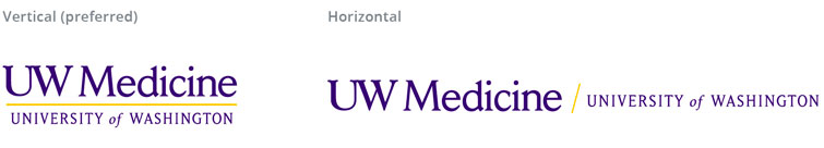
- Vertical is preferred but when space is limited, use horizontal.
- Maintain proper clear space equal to the height of the “M” in the logo around all sides.
- Minimum size: 1 inch wide for print, 72px wide for digital (vertical) and 2 inches wide for print, 150px wide for digital (horizontal)
- Only use approved file types (SVG, PNG, JPG, EPS).
About the Primary logo
The bolder primary logo enhances our presence. Adding “University of Washington” shows our academic strength and clarifies the “UW” acronym in our name for those who are getting to know us better—particularly those outside of the Pacific Northwest. The gold keyline ties everything together and tells our story of “A higher degree of healthcare.” Together, these changes help to position UW Medicine as a leading academic medical center.
Primary Logo Vertical
Primary Logo Horizontal
Logo Placement Guidelines
When using the primary UW Medicine logo, it’s essential to follow visual guidelines brand consistency. These rules preserve the integrity and impact of the UW Medicine brand across all applications.
- Clear space refers to the area surrounding the logo that must remain free from text, imagery or other design elements; this ensures the logo stands out and is easy to read. The required clear space is equal to the height of the “M” in the word “Medicine” on all sides of the logo.
- Minimum size standards ensure the logo is legible across different mediums: for print, the horizontal logo must be at least 2 inches wide, while the vertical logo must be at least 1 inch wide; for digital use, the horizontal logo must be at least 150 pixels wide, and the vertical logo must be at least 72 pixels wide.
- Use the color reverse version of the logo on dark backgrounds to maintain strong contrast and visibility.
- If only a single color ink is available, use the white or black version of the logo.
Clear space
Color reverse

Minimum size

Dos and Don’ts
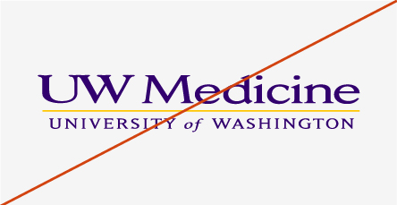
The UW Medicine logo must never be altered, adjusted or redrawn in any way. Inconsistent use detracts from our brand equity and recognition and negates the consistency we strive to achieve. Examples shown here illustrate incorrect uses of the logo. Note: these guidelines apply to all UW Medicine logos (i.e. abbreviated, tagline, entity, service line and remote treatments).
Don’t stretch or compress the logo. Resize it proportionally.

Don’t change the logo colors.

Don’t add effects like shadows, gradients, embossing, etc.

Don’t rotate the angle of the logo.

Don’t crop the logo.
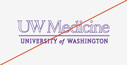
Don’t outline the logo.

Don’t place the logo over busy backgrounds.

Don’t alter the logo fonts.

Don’t use the block W with the logo.
Primary logo with tagline
The UW Medicine primary logo with tagline lock-up reinforces our clinical excellence and unique brand position as the region’s only academic health system. This lock-up can be used on all communications in place of the primary logo or service line logo. The tagline may only be used with the primary logo.

When using this lock-up, the elements may not be altered or rearranged in any manner. Size and proper clear space requirements for the standard logo apply to this lock-up as well. For more information about the tagline, please review the “tagline” page on this site.
The tagline cannot be “locked up” with any logo other than the master UW Medicine logo. The tagline can be used as a sign-off with other UW Medicine-approved logos as long as it is outside of the “lock-up” position.
This tagline is the only tagline approved for use by UW Medicine. Don’t alter it. Don’t use it with the University’s tagline, “Be Boundless.” And don’t create a new, separate tagline for any UW Medicine service line or program.
No other tagline is allowed with the UW Medicine primary brand logo.
The same requirements of clear space, minimum size and color reverse also apply to the tagline logo
Unacceptable usage of UW Medicine tagline logos
The following examples illustrate logos that do not adhere to UW Medicine brand guidelines.

Don’t lock up with any other logo other than the primary logo.

Don’t alter the tagline position.

Don’t use the University’s tagline, “Be Boundless.”

Don’t create a new tagline.

Don’t alter the tagline font.

Don’t alter the tagline size.
To request tagline logo files, email uwmmktg@uw.edu.