
Analyzing and Visualizing Historical Data
Goals:
- What kinds of data organization exist behind the scenes of effective data analysis and data visualization?
- How can data analysis and data visualization be used to make new and exciting historical arguments?
Readings for this workshop (these are also on the syllabus)
- Chapter 3 & Chapter 7, Meredith Broussard, Artificial Unintelligence: How Computers Misunderstand the World (Cambridge: MIT Press, 2018), UW Library ebook.
- “Go Set A Watchman While we Kill the Mockingbird in Cold Blood, with Cats and Other People” Abstract from DHSI Kracow 2016
- Voigt, Camp, Vinodkumar et al., “Language from Police Body Camera Footage Shows Racial Disparities in Officer Respect,” Proceedings of the National Academy of Sciences 114(25) (2017) 6521-6526.
Complete the workshop here (follow the directions below) and turn in on Canvas by the deadline.
Workshop Part 1: Data Analysis and History
What can we learn about historical events using data sets and computers? In this first part of the workshop, you’ll think about that question and write a short reflection.
Meredith Broussard gives an example of how a data set (data on Titanic passengers) can be analyzed using relatively simple tools (statistics; Python, which is a programming language) to answer some basic questions. Your job in this workshop is to think through whether you could do something similar with one of the three data sets below.
Step 1: Pick one of these three data sets
- A Titanic passengers data set (download here, at the link “titanic.csv”, shout out to Stanford CS109. csv=comma separated values)
- A THOR data set on World War I bombing — for info on THOR and the source of the data see the THOR page at data.world. You can join data.world for free and download all kinds of THOR data and read about the THOR project, but you don’t have to do that for this workshop. I downloaded this data set for you. You can access it on Canvas. Go to the Files tab on Canvas, there’s a folder called ‘data sets for Workshop 2.’ In that file you’ll see ‘THOR_WWI_clean.csv.’
- Data from Prof. M’s research-in-progress on people accused of sex and gender “crimes” in Nazi Germany. Download it from our Canvas site. Go the Files area in Canvas, there’s a folder called ‘data sets for Workshop 2,’ inside there’s an Excel file called ‘Prof. M data Nazi State policing project.’
Step 2: Write a paragraph
Write a paragraph reflecting on what questions about history you could use your data set to answer, and (roughly) how you could go about analyzing the data to answer those questions. Your goal: come up with something new we could possibly learn about history by applying methods like what Broussard applied to her data set, without duplicating what she did.
As you describe how you’d go about analyzing the data, it’s OK to fudge the details — we don’t expect you to know how to use Python or anything like that. Pretend for a moment that you’re working on a team with someone who does know how to use lots of computing tools to work with databases. What would you like them to do? For example, you could have team members use some tool that you don’t know how to use to calculate how variable Y seems to impact variable X in the data. (Think of the Broussard example if you feel lost.)
Step 3: Edit your paragraph. If you haven’t already, address some or all of these questions.
In addition, In your reflection paragraph, also consider the following questions.
- Where is your data from? Can you trust the source?
- Unless you’re working with the Nazi policing data (the source of the info is a column in the spreadsheet, see if you can tell which one) you’ll have to go to the websites linked above to try to see where the data is from. (Hint: for the Titanic data, look at the top of the page from whence you grabbed the csv, under the page title. For the THOR data, you’ll have to surf around on data.world to try to figure out where the heck they got that data, it purports to be from the records of the services in question but can we be sure?)
- Is your data complete and/or accurate? (Kinda impossible to tell for sure, but what’s your guess? What steps could you take to have a better sense of whether this data is complete and accurate?)
- Has your data been “cleaned,” as far as you can tell? Might that process have set up some potential problems that you ought to flag?
- Does your data need to be cleaned? If so, describe what would need to be done.
- Some of the most clear conclusions from these data sets are things historians have already verified using archival research. For example, we already know from survivor accounts that gender and class affected one’s chances of surviving The Titanic. You don’t know everything that’s already been proven by historians about the topics at hand, but you can make a good guess as to what probably is — it’s probably not going to surprise historians of the First World War that one country had a much more active air force than another, for example. Given that, can you think of any way this data could be used to show something new?
- Often people working with data sets will cross reference one set of data against another. In your reflection, feel free to suggest this. For example, you might suggest that if the bombing data could be cross referenced against another data set that may or may not exist, we might be able to see something new.
Step 4: Save your paragraph and go on to Part 2
You’ll turn in this part plus Part 2 as one document, on Canvas, see directions below.
Workshop Part 2: Linguistic Data Analysis and Visualization
In the second part of this workshop, you will learn to use Voyant, an open-source, web-based text reading and analysis environment, in order to visualize data about word frequency and collocation in three fictionalized memoirs set during the First World War. These memoirs are:
- Henri Barbusse, Under Fire: The Story of a Squad (French, first published 1916)
- Robert Graves, Good-Bye to All That (English, first published 1929) *be sure to download the “PDF with text” file for this book. The plain “PDF” version is just a scan and Voyant can’t read it*
- Ernst Jünger, The Storm of Steel (German, first published 1920)
As we’ve discussed in class, these three memoirs share some contextual similarities, but have significant differences: for instance, all three authors served on the Western Front, but each one fought for a different nation (France, England, and Germany, respectively). Today, you’ll use one of Voyant’s tools to explore how these similarities and differences—in terms of the texts’ publication date and national origin, or the authors’ gender, class, or age—are reflected in the kinds of words the authors use across the entirety of their texts.
Specifically, Voyant Tools can answer questions like:
- What words appear most commonly in a given text? (frequency)
- How are specific words distributed throughout the duration of a given text? (trend)
- Within a given text, which words are likely to be associated with each other with a frequency greater than chance? (collocation)
For this workshop, you will be asked to:
- Devise a question, based on one of the questions above or on one of your own, that will allow you to compare textual features of the three memoirs. For instance, you might ask which of three authors most often uses the word “home”, or which words each of them associates most frequently with the word “trench”. This question can be pretty basic, but think about the kinds of questions that historians using these memoirs might be interested in. What insights could a historian gain by turning a memoir into data?
- Generate one or more visualization projects based on one of Voyant’s data visualization tools, either one visualization that illustrates a comparison between all three texts or a separate visualization for each text. You’ll be asked to export these projects as unique URLs included in your reflection.
- Write a very short reflection telling us the question you were trying to answer, and reflecting on the data visualizations generated from it. More info on this below. Remember, you are trying out a very basic version of linguistic data analysis here – you might find that you feel unsure about what this kind of analysis can offer. That’s ok!
In order to complete this part of the workshop, you will need:
- PDF texts of the three novels, which can be downloaded from the links above or [here], [here], and [here]. These files are hosted by The Internet Archive, and are all available on-line because they are now out of copyright. To save these texts to your computer as PDFs, find the PDF version under “Download Options” below the images of the book and click on the “PDF” link.
- Access to the Voyant environment in your browser, found at https://voyant-tools.org/
Using Voyant: A Brief Tutorial
Before you can begin working, you’ll need to upload the text of the three novels into the Voyant environment. Collectively, these documents are referred to as a “corpus”.
Start by opening Voyant on your browser. You should see a welcome screen that looks like this:
In the “Add Texts” box in the middle of the screen, navigate to the button labelled “Upload”. Click on it. This will open a dialog box that will let you select the three PDF files you’ve saved to your computer. When you’ve done so, select “Open”. Voyant will automatically upload these files and open a tools interface.
***If you are having trouble uploading your PDF files to Voyant, do these things:
- Check that you have downloaded the “PDF with Text” of Goodbye to All That. Voyant won’t read the other version.
- Try uploading each book PDF in its own Voyant tab – you can do this assignment by just comparing each book across three different Voyant tabs – one for each book.
- Try and get at least two books uploaded, either in same Voyant tab, or in two separate tabs. Follow all the directions from here on, just use two books. No need to email us if this is the route you have to go – just make a note in the document you turn in on Canvas that you were having trouble with the uploads.***
If you had no trouble, you should now be looking at a window composed of six panes, each of which represents a different tool Voyant offers for interpreting your textual data.
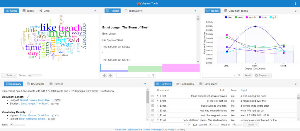
Broadly speaking, Voyant Tools come in three different formats: reading tools, grid tools, and data visualization tools. Reading tools (e.g. the middle pane on the top row) show the text itself, or blocks of text, and allow you to find words in context. Grid tools (e.g. the right-hand pane on the bottom row) display data in a spreadsheet format. For instance, the Contexts tool at bottom right displays each instance of a selected word in a unique row, with columns for the document title, the word itself, and the phrase that appears to the left and right of that word.
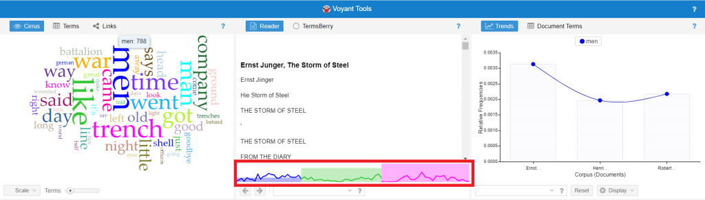
These six panes are dynamically linked: selecting a data point in one pane will affect the information displayed on the others. For instance, if I select the term “MEN” in the top-left (Cirrus, word-cloud) tool, you can see that the Reading tool in the middle pane changes: now it displays a line graph charting the frequency with which the term “MEN” is used across the three texts (outlined in red).
However, for the purposes of our workshop, we’ll be focusing on just one of these three types of tools: the data visualization tools.
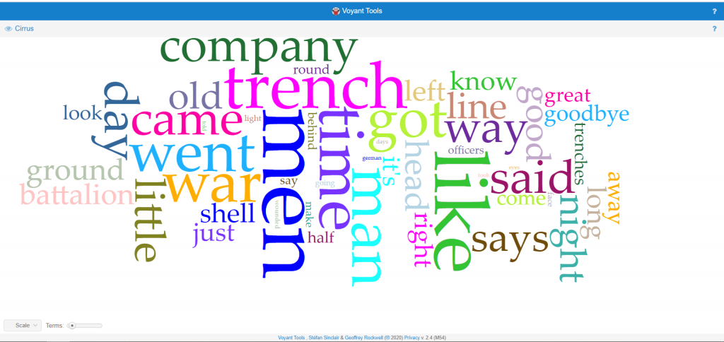
Because we’re focusing on just one tool in this workshop, you’ll probably want to create a less cluttered interface to work with. Do this by hovering your cursor over the header of the top-left Cirrus tool. You should see a set of icons pop up (outlined in red).
Click on the left-hand “Export” icon (looks like a square with a diagonal arrow.) The option to export “A URL for this view” should be automatically selected; click “Export”. This will open a new window in your browser that displays just the Cirrus tool:
Next comes the creative part! You’ll experiment with Voyant’s various data visualization tools until you find one that generates an image relevant to your question. Take some time to try a few different tools – you might also decide to change the parameters of your question as you explore different visualization tools and new and interesting things present themselves to you. Great! Historians revise their questions and theories all the time.
You can change the type of tool displayed in your window by, again, hovering over the header to display the set of four pop-up icons
This time, you’ll click on the icon shaped like a window, second from left. Navigate to the second item on the list, the icon shaped like an eye with the label “Visualization Tools”. The next pop-up window will display a set of tools you can use to create visualizations of data from individual documents. Selecting one of these will change the type of visualization displayed on your screen.
The bottom left corner of the screen will display options specific for the tool you selected. Some will have drop-down menus that allow you to select a single word, for example. Some will have sliders that allow you to adjust the number of terms the tool is searching for. Play around with these settings.
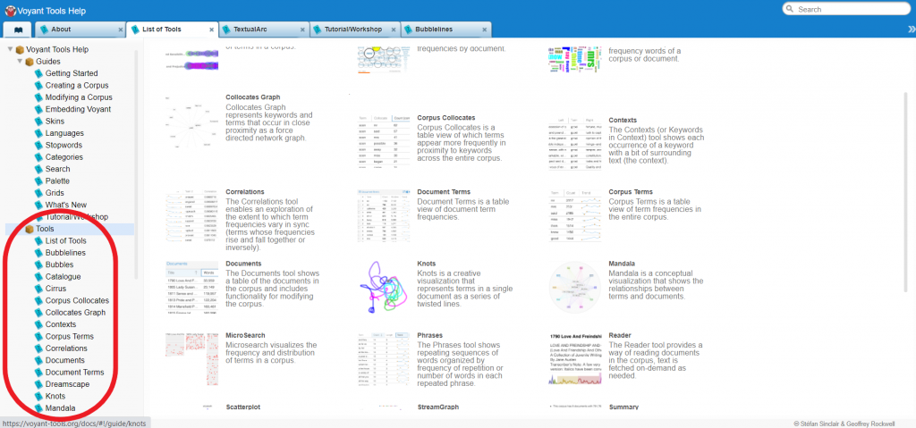
Detailed descriptions of each tool can be found in Voyant Tools Documentation, found here. The landing page has thumbnails and a brief description of all the options. From this page, you can navigate via the menu at left to more detailed descriptions of tools you’re interested in (circled in red).
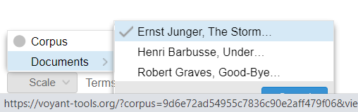
NOTE that some types of visualization pull data from the full corpus of documents to draw comparisons between them, while others pull from individual documents. Because we’re interested in comparisons between the three memoirs, when you’re using a document-level tool (Bubbles, Cirrus, TextualArc, Trends, or Knots) it’s important to define the data set your visualization is drawing from.
Do this by navigating to the drop-down button at the bottom left labelled “Scale”. Hover over “Documents,” then select the text you want to examine first from the list that pops up at left. The selected text will display a checkmark.
If you’re using one of these document-level tools, you’ll need to export three visualizations as project files to turn in —one for each memoir. For corpus-level tools you will only need to turn in one file.
Finally, once you’ve generated a visualization that is both interesting visually and pertinent to your question, it’s time to showcase your work! You’ll need to export your project as a unique URL (or set of three URLs) so that others can visit and interact with your visualization.
This process is the same as the process you used to open your project in a new window: hover over the header of the pane, select the “Export” icon, and, assuming the option export “A URL for this view is selected”, select “Export” again. Then, highlight the URL(s) in your search bar, copy it, and paste it/them at the top of your written reflection when you hand it in.
If you have prior experience with text-based data visualization and want to experiment with more of the tools Voyant has available, feel free! This workshop is just scratching the surface of what Voyant can do.
What to turn in:
In the same document as your answers to Part 1 of this workshop on mapping, add the following:
- The URL to your comparative visualization, or the 3 links to your 3 individual visualizations for each book.
- In one sentence, state the question you are trying to answer with your visualization (such as “Which of these 3 authors uses the word “home” most often?” or “Across the 3 books, which words appear near the word “trench” most often?”)
- In a very short paragraph of 3-5 sentences, tell us the answer to your question based on your visualizations, and point us to one or two interesting details in your visuals. Then, reflect on whether or not this kind of visualization helped you learn anything new about how soldiers wrote about their experiences of the First World War. What changes would you make if you were designing a bigger linguistic analysis project? What are the problems presented by linguistic analysis of historical texts?
Then, turn in your document containing answers to both Parts 1 & 2 to Canvas.