Originally posted on April 25, 2020 at https://fanfictiondatascience.tumblr.com/post/616410483256328192/a-prototype-review-visualization-tool-for-the.
Authors: Netra Pathak and Kush Tekriwal
Hey there! We’re back, the researchers studying the fanfiction community at the University of Washington’s Human-Centered Data Science Lab. This time around, we’ve created a prototype feedback tool that we hope will be helpful to the fanfiction community. The tool will contain dashboards with concise summary reports and trends of an author’s reviews that may help the author reflect on their writing. We have a personal motivation to enhance the joy of writing, and are interested in hearing what authors think of our prototype tool.

Introducing the Concept
We’ve found the fanfiction community provides just the right kind of encouragement with its self-sustaining, distributed-mentoring setting. (Distributed mentoring differs from standard mentoring because it’s shared in small pieces by a large number of people.) This environment improves the writing of many authors but also boosts self-confidence. Hence, we thought that gathering review summaries and offering a reflection tool of all feedback received might be useful. This might help to further improve writing proficiency.
In this part of our study, the overarching research question we have is: “How can visualizations help fanfiction authors further enhance their learning from reviews?”
We’re interested in your feedback on this prototype visualization tool.
Our hypothesis is that providing an author with a holistic overview of all their reviews, customizable to the story or chapter level, may help the author glance over their work and synthesize areas of improvement. We believe learning from the feedback given in a distributed-mentoring community is important, and the technique of visual analytics (interactive visualizations combined with computation and analytical reasoning) can enable authors to recognize their strengths and weaknesses as writers. In addition, these reports may help authors understand why some chapters are received better than others and whether they have any other correlating factors such as time or other factors.
The tool could be extended to the fandom level, so authors could follow other author trends based on common fandoms, etc.
Background Information and Context of Data
We leveraged a dataset collected by the UW Human-Centered Data Science Lab that contains more than 176 million reviews from Fanfiction.net [2]. For our prototype analysis, we only used a subset of the data of authors and their stories and reviews.
For the purpose of analysis, we have machine-classified reviews into a few categories. The review classifications are generated by ALOE (Affect Labeler of Expressions), an open-source tool developed to train and test machine learning classifiers to automatically label chat messages with different emotions or affect categories [3].
In regard to this blog post, a review can fall into one or more of the 5 categories. Table 1 below provides a description for each of the 5 categories [1] and Table 2 provides sample reviews for each of the 5 categories.

Review Trend Dashboards in the Tool
Below are the screenshots of some of the dashboard screens in the feedback tool. Through these dashboards, we hope each author can explore the story of their journey in the fanfiction community. Please be informed that as the data is sensitive, we have anonymized our results.
Differential privacy techniques have been used and the number of reviews in all figures do not represent any individual author’s actual count. Also, in Fig 4 and subsequent figures, the story ID and/or author ID do not represent the actual ID on fanfiction.net.
The first three screenshots focus on review types and trends of an individual author over time. We thought it would be interesting for authors to see the trends of the types of reviews they have been receiving over the entire year or on a weekly/monthly basis. This can enable them to analyze their peaks and dips, relate them to any external events, etc.

Fig 1: Overall review trend for one particular story of an author based on different review types over a time period of one year. (The trend can also be seen for all stories together, where the number of reviews equals the sum of all reviews of all stories.) Hovering over a data point gives the details in a tooltip.
In Fig 2, Fig 3 and Fig 6, stacked bar charts are used to show a larger category divided into smaller categories and what the relationship of each part has on the total amount. For example, different review categories as part of reviews received over a month (i.e. a larger category). In that case, each bar represents a whole (all reviews received in a month/week), and segments in the bar represent different parts (review categories) of that whole. Hovering over a segment of the bar chart highlights details specific to the segment.
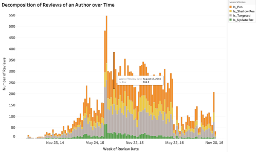
Fig 2: Review type breakdown of all the stories of a particular author over time (weekly). Time can be customized to be at a weekly, monthly or yearly level. Please note, the review categories here are not mutually exclusive which results in an increased number of reviews for a few types.
Fig 3: Review type breakdown of the stories of a particular author over time, with the review categories being mutually exclusive. Time can be customized to be at a weekly, monthly or yearly level.
Now, combining the above screens in one dashboard, we can either see the review breakdown and its trend for all stories together or for each story differently. For each story, we can also see the estimated chapter published dates and link them to the review dates. Hence, this way the dashboard is customizable to reflect either all stories or at story/chapter level.

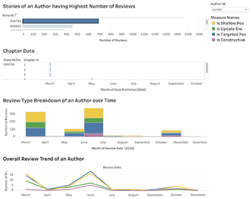
Fig 4: The dashboard contains the review breakdown in multiple categories, as well as the estimated chapter published date for a single story of an author. The above results are for a particular author ID 317330 (all IDs are anonymized) for a single story ID 936798 (blue highlighted) and similarly, we can see for each of the individual story IDs or for all stories together (see Fig 5 below).

Fig 5: The dashboard contains the review breakdown in multiple categories, as well as the estimated chapter published date for stories of an author. These stories are ordered by the number of reviews received by that particular story of the author. Here, it may be assumed that the stories that have received the highest number of reviews are the popular stories for the author.
The final dashboard below enables authors to see at a glance the number of reviews of each of their stories, while also being able to juxtapose their stories. Every author will have stories that receive more reviews and ones that receive fewer, and these dashboards may give them the ability to learn which story characteristics may lead to a greater number of reviews.

Fig 6: The dashboard gives informative review details for all the stories of an author. We can see the number of reviews received monthly and the review categories breakdown for each story of an author. This dashboard potentially gives the ability to analyze which stories were a success and received a lot of update encouragement and positive feedback, while on the other hand, which stories received critical acclaim, constructive feedback, etc.
Does Analysis Matter?
There is an obvious question in mind while seeing these visualizations and data trends: How does the analysis help? How is this reflection beneficial? Just like how customer feedback is crucial for future product development and improvement, no matter the size of the organization; similarly it doesn’t matter if I am an author starting out, a well-versed author mid-way in my writing experience, or a proficient author. Analysis provides a better view of what needs to be changed or improved, if any, whether you are an individual, or represent a group, business or company. Such information can be used to make informed decisions. For example, in the context of fanfiction, for a starter it may be useful to know what kind of stories are read and reviewed more and why, what kind of plots are acknowledged more, etc. For an author who has written multiple stories, it may be useful to know which stories received maximum appreciation to continue using similar components and keep up his/her fanbase.
However, all said and done, these are just our speculations! We want to know what you think! We want to know from you if such analysis is helpful to the fanfiction authors, or if you would like some changes. We would love to pivot in the direction that is most useful for you.
That’s a Wrap
As we deliver this system of dashboards, we hope to create a positive impact by highlighting the trends and summary reports of review types for the stories of an author. For example, new authors in the community may be able to observe trends such as an increasing number of update encouragement reviews and in turn might feel encouraged to write more. :D
The tool and the dashboards are a medium to see feedback from other authors and readers over time.
We will also be encouraged if we get feedback from you. Please share your thoughts and comments so we can learn about your likings as well! To validate our research, we would also love to work with members in the fanfiction community and know whether our solution is effective or not. We would like to extend this work based on the responses we receive.
This is it for now! In the coming months we will develop more dashboards and post them as there are a plethora of questions we can ask this data. Heartfelt thanks for taking a look at our prototype. If you have any questions or want clarification on any of the data, please don’t hesitate to reply to this post, reblog with a comment, or send an ask. We’ll be happy to clear up any confusion the best we can!
Acknowledgments
We would like to express our deepest gratitude towards Prof. Cecilia Aragon and Jenna Frens at the Human-Centered Data Science Lab for their useful critiques, ideas, constant guidance and enthusiastic encouragement of this research study. It was an honor to work with them.
Additional Information
Earlier research in our group, published in the paper ‘More Than Peer Production: Fanfiction Communities as Sites of Distributed Mentoring’ has outlined 13 categories that were observed in Fanfiction.net reviews [1].
1. Evans, S., Davis, K., Evans, A., Campbell, J. A., Randall, D. P., Yin, K., & Aragon, C. (2017, February). More than peer production: fanfiction communities as sites of distributed mentoring. In Proceedings of the 2017 ACM Conference on Computer Supported Cooperative Work and Social Computing(pp. 259-272). ACM.
2. Aragon C. Human-Centered Data Science Lab » Distributed Mentoring in Fanfiction Communities. https://depts.washington.edu/hdsl/research/distributed-mentoring/. Published 2019. Accessed June 5, 2019.
3. Brooks M. etcgroup/aloe. GitHub. https://github.com/etcgroup/aloe.
4. University of Washington, Human-Centered Data Science Lab » Research »Distributed Mentoring in Fanfiction Communities. https://depts.washington.edu/hdsl/research/distributed-mentoring/
