
by James Gregory
In migration terms, North Carolina and neighboring Georgia can be considered "turn-around states." Like many other southern states, North Carolina spent most of the 19th and 20th centuries exporting people. In the early 1800s, tens of thousands of enslaved North Carolinians were sold and marched in chains hundreds of miles westward to expand the cotton kingdom. The state's population expanded gradually over the next 140 years, dependent almost entirely on what is called "natural increase," a euphemism for the work of mothers. Out-migration numbers routinely exceeded in-migration. African Americans were more likely to leave than whites and went in different directions, Black folks moving north, White folks mostly to other southern states.
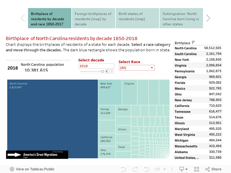
In the 1960s, things begin to change as Vietnam-era military bases and the opening phase of the sunbelt shift attracted the first substantial increase of newcomers in more than a century. That attraction increased in each decade since (as can be seen by watching the dark and light blue portions of the chart). And North Carolina's population numbers began to surge, growing my more than half million a decade in the 1970s and 1980s; by more than a million in the decades after 1990.
Newcomers now outnumber natives in the adult population and nearly match them overall. Click between 1950 and 2022 to see the dimensions of the "turn around." They have been coming from everywhere. Nearly 10% of North Carolina's 2022 population is from New York, Pennsylvania, and New Jersey. Other northern and western states contribute at least 10% more. But people have also been coming from abroad, especially Mexico and India.
This visualization tool is hosted by Tableau Public and may take a few seconds to respond. If slow, refresh the page. Click here for other state migration histories.
Move between four visualizations with tabs below
Note on data issues: The 1850 and 1860 censuses counted only "free persons" so it was not until 1870 that reliable data on African Americans became available. Native Americans were not routinely included in decennial censuses until 1900. Birth state information is missing for about 5% of US-born persons in 1970 and about 2% in 1960. The missing are designated "United States,ns" in the charts.
Source: U.S. Census data from the Minnesota Population Center's IPUMS USA: Steven Ruggles, Katie Genadek, Ronald Goeken, Josiah Grover, and Matthew Sobek. Integrated Public Use Microdata Series: Version 6.0 [Machine-readable database]. Minneapolis: University of Minnesota, 2015, the following samples: 1850 1%, 1860 1%, 1870 1%, 1880 1% 1900 1%, 1910 1%, 1920 1%, 1930 1%, 1940 1%, 1950 1%, 1960 5%, 1970 1% State FM1, 1980 5% State, 1990 5% State, 2000 1%, 2010 1% ACS, 2022 1% ACS.
Maps, data development, calculations: James Gregory.