
by James Gregory
The Great Migration out of the South lasted three-quarters of a century, slowing in the 1970s. Since then Black Americans have been moving to the South in large numbers, in some sense reversing the Great Migration. But the story is more complicated. The southern exodus was largely from the rural South whereas the new migration has little to do with rural areas, or with states like Alabama, Mississippi, Arkansas, and Louisiana which saw so many leave during the Great Migration. The big cities of Georgia, Florida, Virginia, Texas, and North Carolina have attracted most of those participating in the Move South, and often these migrants have come with skills and advanced education. Mostly this has not been a return migration. Some were born in the South, but except for the senior generation, they are usually not returning to home settings. Most were born in northern or southern states, children or grandchildren of those who left the South during the exodus.
Here are interactive graphics and maps that allow us to track the move South in the decades since 1950. The data are based on birthplaces and show the number of Black and bi-racial Black persons born outside the South living in a southern state at the end of each decade. Select a state and see where people were born, both other countries and other states. (See explanation of data and how to interpret it below). This visualization tool is hosted by Tableau Public and may take a few seconds to respond. If slow, refresh the page.
Move between four maps and charts with tabs below
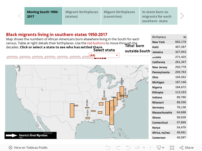
Data issues: The total volume of migration cannot be calculated from these data which do not count persons born in the South who left and later returned. Moreover, the decade-by-decade changes do not take into account mortality or intra-decade migration. Note also that birth place information is missing for about 5% of US-born persons in 1970 and about 2% in 1960. These birthplaces are labeled "United States, ns" in the charts.
Source: U.S. Census data from the Minnesota Population Center's IPUMS USA: Steven Ruggles, Katie Genadek, Ronald Goeken, Josiah Grover, and Matthew Sobek. Integrated Public Use Microdata Series: Version 6.0 [Machine-readable database]. Minneapolis: University of Minnesota, 2015, the following samples: 1900 1%, 1910 1%, 1920 1%, 1930 1%, 1940 1%, 1950 1%, 1960 5%, 1970 1% State FM1, 1980 5% State, 1990 5% State, 2000 1%, 2010 ACS 1%, 2022 ACS 1%.
Maps and calculations: James Gregory.
Additional maps and charts
Mapping the Great Migration
See our interactive maps and data tables about the Great Migration of African Americans out of the South. Use them to investigate volumes and directions.
Big Cities and Great Migrations
Who settled in the big cities of the North and West? These interactive maps show the answers decade by decade.
Black Migration History for Individual States 1850-2017
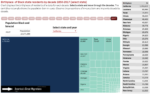
Black mobility began in the 19th century and continues into the 21st. Here are interactive graphics and maps that allow us to track the changing population of each state decade-by-decade since 1850. Select a state and see where people were born, both other countries and other states.