Banners
|
Banner Types & Usage Guidelines
|
Banner Layout & Digital Styling
|
Content Guidelines & Character Count
|
|
Overview
Banner definition:
In the context of web design, a banner typically refers to a rectangular graphic, designed to attract attention and encourage users to take action on a specific topic or offer. They can also serve as navigation tools, guiding users to another webpage or website.
How UW Medicine uses banners:
UW Medicine typically uses banners for marketing, announcements, navigation and branding.
Figure 1.0 – Banner naming diagram
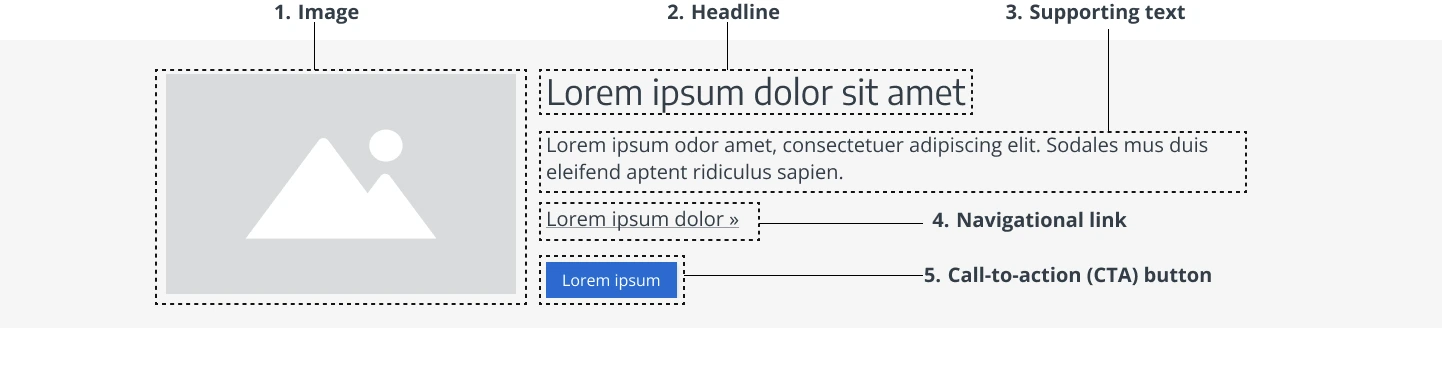
Component Elements
- Image: The banner image may serve as a navigation wayfinding element. This means it is often the same hero image from the linked page in the banner. For more details, refer to the Image Guidelines↓ section below.
- Headline: The headline is the most important part of the banner and often communicates the primary message or goal of the banner (e.g., promotion, new product, service offering). For more details, see the Content Guidelines↓ section below.
- Supporting text (optional): The supporting text is a brief line of text below the headline that clarifies the headline without providing too much detail. For more information, refer to the Content Guidelines↓ section below.
- Navigational link (optional): A navigational link that directs users to a different section of the website or to another page on the web. For more details, see Content Guidelines↓ section below.
- Call-to-action (CTA) button: An action button should have a clear, concise label that directs users toward an immediate action (e.g., submitting a form, opening a popup, or logging in.) For more details, see Content Guidelines↓ section below.
Banner Types & Usage Guidelines
Banners can be used, as appropriate, across uwmedicine.com pages. To request a banner for a specific page, please ensure you have approval from the relevant page owner before proceeding with implementation.
There are three primary types of banners, each serving distinct purposes based on their duration and relevance:
- Temporary Banners
- Semi-Permanent Banners
- Permanent Banners
Temporary Banners
Duration: Displayed for a short period, typically tied to a specific event or time-sensitive information.
Purpose: Used to convey urgent, time-sensitive messages. Once the message is no longer relevant, the banner is removed. Temporary banners are often paired with additional alerts linking to more detailed information.
Update Frequency: Typically not updated, but replaced or removed once the event or issue concludes.
Examples:
- Health screenings for specific conditions
- Health fairs hosted by hospitals or clinics
- Fundraisers for medical causes (e.g., breast cancer awareness, research funding, blood donation drives)
- Research clinical trials for specific conditions
- Guest speaker events or health education seminars
- Pop-up or temporary clinics in response to public health needs
- Specialized health observance days (e.g., Wellness Day, Mental Health Awareness Day)
Semi-Permanent Banners
Duration: Displayed for an extended period but not indefinitely. Semi-permanent banners are intended to remain visible for a longer time, with periodic updates.
Purpose: Used for ongoing, but changeable messaging that can be rotated to keep content fresh and relevant. These banners should evolve over time but do not require constant updates.
Update Frequency: Updated periodically, typically every few months or when new campaigns occur.
Examples:
- Annual awards (e.g., Magnet recognition, Beckers annual healthcare award, physician of the year)
- Ongoing promotions or services (e.g., “Sign up for paperless billing” or other offers)
- Seasonal health campaigns (e.g., flu season, health awareness month)
- Key calls-to-action (e.g., new product launches, program sign-ups)
- Patient education campaigns (e.g., mental health awareness, diabetes workshops)
- Health reminders (e.g., vaccination or screening reminders)
- Patient success stories (e.g., successful surgeries or treatments)
- Brand messaging and values (e.g., “Committed to sustainability” or other mission, vision, or core values)
Permanent Banners
Duration: Displayed indefinitely, often for core information that is always relevant. These banners remain visible for extended periods, serving essential site functions.
Purpose: Used for critical, always-relevant content, often related to patient safety, legal requirements, or core services.
Update Frequency: Rarely updated, only when significant changes occur (e.g., legal updates, branding changes).
Examples:
- Legal or compliance banners (e.g., GDPR, HIPAA, privacy notices, cookie consent)
- Emergency contact information (e.g., “Call 911” or “Visit your nearest emergency room”)
- Access to patient portals
- Health advisory banners (e.g., COVID-19 updates, ongoing health crises)
- Support services contact information (e.g., billing assistance)
- Appointment scheduling calls-to-action
Banner Layout & Digital Styling
For banner design support, consult a user experience designer on the Digital Experience team.
Banner Layout & Placement
How banners appear on mobile and desktop
The text length affects banner design and layout.
Goal: Keep the copy concise for optimal readability and user experience across devices. See the example below comparing mobile and desktop views with the same copy.

Single banner
For standalone banners with unique content, use a background color that contrasts with other sections on the page to mark section shifts.
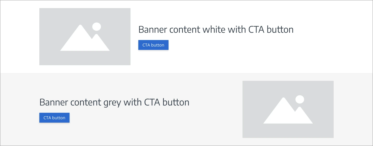
Multiple banners
For multiple consecutive banners with different content, place the first banner image on the left and the second on the right to create an alternating pattern. Each banner represents a separate section of the page.
Banner Styles & Guidelines
When designing webpage banners, use best practices to ensure clear content separation, boost user engagement, and create a visually appealing experience. Keep the design user-friendly and accessible to maintain a seamless experience for all visitors.
- Use color alternations strategically to separate major sections and improve content hierarchy (e.g., alternating white and light grey H2 sections).
- Avoid excessive high color contrast switching to reduce visual overload and minimize the risk of triggering seizures in individuals with photosensitive epilepsy. (e.g. avoid alternating too many light and dark colored sections)
- Ensure high contrast for readability, adhering to accessibility standards (e.g., white text on dark purple banners).
- Match colors to the intention of the content: Use bold colors for promotions and muted tones for informational sections.
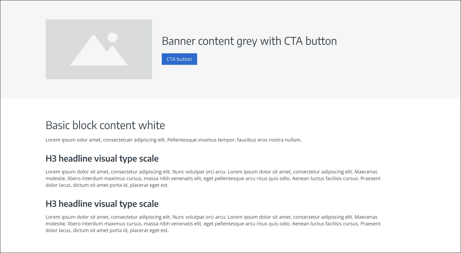
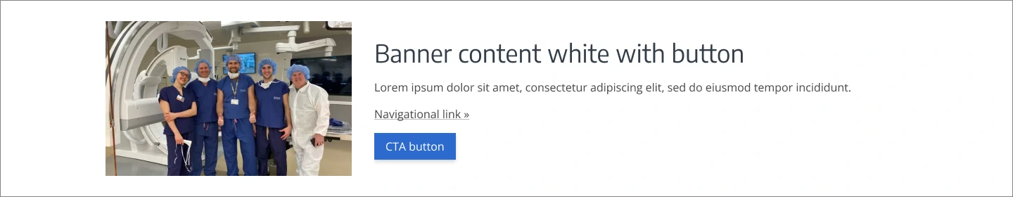
Style 1: White banner with blue solid button
For banners with white backgrounds, use the solid blue button for call-to-actions.
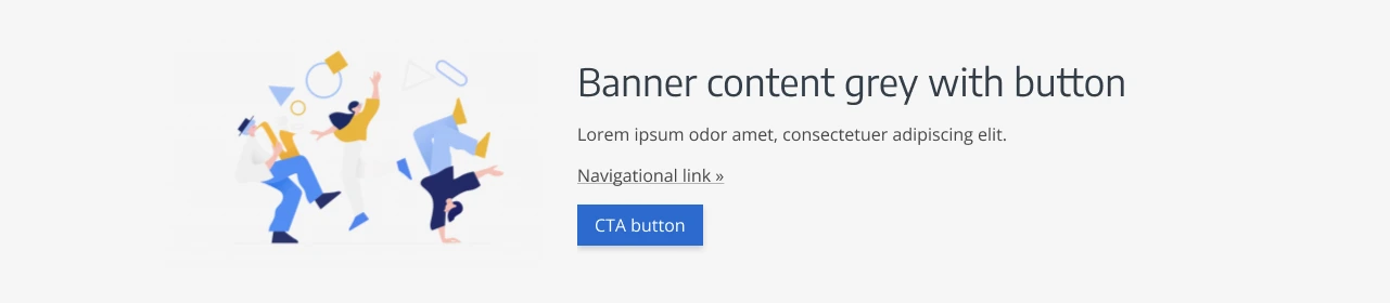
Style 2: Light grey banner with blue solid button
For banners with light grey backgrounds, use the blue solid button for call-to-actions.
Style 3: Dark purple banner with white outline button
Dark background sections can offer great benefits like visual contrast, modern aesthetics, and emphasis on content. However, if overused or poorly executed, they can reduce readability, create visual fatigue, and present accessibility challenges. It’s important to strike a balance by using dark sections strategically, ensuring proper contrast, and considering the context of the content being presented.
For banners with dark purple backgrounds, use the white outline button for call-to-actions.

 Do not use blue buttons on purple banners.
Do not include more than 1 dark purple background section on the page.
Content Guidelines & Character Count
Disclaimer: If the banner content relates to information already on the page, consider integrating it directly onto the page rather than using a banner.
For content support, see Writing for Digital Channels or consult our digital content experts on the Digital Experience team.
Alt Text for Image
Alternative text (or ‘Alt text’) is a brief description of an image that helps people with visual impairments understand its content, especially when using screen readers or Braille devices. Accessible images should either have descriptive alt text (if they convey important information) or be hidden from assistive technologies (if they are purely decorative).
Learn more about alt text technical requirements either at W3.org: Alt Text for Images, or consult our digital content experts on the Digital Experience team.
Headline
The headline is short, scannable, and previews key information in the supporting text or leads users to more detailed content on the following page.
- Keep it short and scannable: Aim for 5-7 words and use simple language to ensure it’s immediately understandable.
- Use sentence case: The headline should be sentence case, with proper nouns capitalized, if included.
- Simplify when needed: If there are two headlines considered, combine and condense them to streamline the text and simplify the message.
- Maintain consistency with brand voice: Ensure the headline aligns with UW Medicine’s brand tone and voice.
Character count guidelines: 5-99 characters w/ spaces*
*These counts are estimates based on 3 lines of text on desktop, which equals 4 lines on mobile. These are calculated to accommodate common screen sizes for UW Medicine users.
Supporting Text (optional)
The supporting text is a short line of text that adds clarity to the headline without overwhelming the user.
- Avoid clutter: The text should be concise, offering just enough information while deferring more details to other pages.
- Use only when needed: If the headline is already clear, it’s better to skip the supporting text.
Character count guidelines: 39-239 characters w/ spaces*
*These counts are estimates based on 3 lines of text on desktop, which equals 6 lines on mobile. These are calculated to accommodate common screen sizes for UW Medicine users.
Navigational Link (optional)
A navigational link directs users to a different section of the website or to another page on the web.
- Avoid jump links or anchor links: Do not use navigational links for navigating within the same page.
- Limit to one primary link: Focus the user’s attention on the main action by including just one navigational link.
- Use two complementary links if necessary: If you must include a second link, ensure it offers a related but distinct option.
- Avoid more than two links: Adding more than two navigational links can clutter the banner and dilute its message.
Call-To-Action Button
A call-to-action button (or ‘CTA button’) encourages users to take immediate action, such as submitting a form, opening a popup, or logging in. Banners, which are designed to direct users to another page or website on a specific topic, generally perform better when they include a CTA button, as it enhances user engagement and drives conversions.
- Be clear and action-oriented: The text on a CTA button should be clear, concise, and action-oriented, such as “Book an appointment,” “Access MyChart,” or “Take a Health Assessment.”
- Do not use CTA buttons as jump links or anchor links: CTA buttons should not link to other sections on the same page. They should guide users toward key actions, not navigation within the page.
- Use CTA buttons to drive user interaction: CTA buttons are highly encouraged to boost user engagement and conversions. However, if a banner is purely informational or branding-focused, the CTA button can be omitted when not necessary.
Image Guidelines & Sizes
The banner image often serves as a navigational element and should match the hero image on the linked page. Choose high-quality, relevant images that align with UW Medicine’s brand tone.
To ensure up-to-date, optimized images, all photos must be approved via a release form and uploaded to Bynder, UW Medicine’s Digital Asset Management (DAM) system.
For UW Medicine brand photo styling, refer to the Photography Style Guide. For additional assistance, see Support section below.
Figure 2.0 – The default banner image size for desktop devices

Desktop image sizes:
Include the following desktop default image sizes for banners:
- 700×394 pixels – (2x) image quality
- 350×197 pixels – (1x) image quality
- Original image size
Image ratio: 16:9
File types supported:
- .WEBP (recommended) – Best for overall web and mobile optimization, smaller file sizes, and high-quality images (especially for photos, images with transparency, or animations). Requires modern browser support.
- Detailed image file size: 10KB – 30KB
- Simple image file size: 5KB – 15KB
- .JPEG – For photographs where file size reduction is key and slight quality loss is tolerated. Supports all major browsers.
- Detailed image file size: 15KB – 40KB
- Simple image file size: 10KB – 25KB
- .PNG – For logos, icons, text-heavy images, or images requiring a transparent background or lossless compression. Supports all major browsers.
- Detailed image file size: 30KB – 80KB
- Simple image file size: 15KB – 40KB
Support
For content and user experience design support or questions about UW Medicine’s website components and digital style guidelines, please submit a request to the Digital Experience team.
For visual design and graphic support like icons, illustrations, photos or questions about UW Medicine’s visual design and brand style guidelines, please submit a request to the Content & Brand Services team.
For banner technical specifications see the Component Library: Banner. For questions about UW Medicine’s Component Library please submit a Zendesk request to the Web Operations team.