Cards

ATTENTION: Page Under Construction!
For image size specifications for web design components, contact Jen Kho, our UX Designer.
Small Emphasis Cards
Small text emphasis cards are built with a header (H3), body text and a button. They are recommended for use when presenting information of the same “type” in a uniform way.
Background
- Small text emphasis cards should never be placed in a section with a white background.
- Small text emphasis cards can be placed in sections with a diagonal or grey background.
Usage guidelines + behavior
- The small text emphasis cards can be placed in rows of 2-4 cards
- The character count for H3, body text and button text varies based on the number of cards in a row.
- Only 1 button is allowed per card.
- A single button color must be used per section of small text emphasis cards.
- Blue is recommended for most use cases, however the additional button colors can be used for campaigns and non-appointing use cases.
Button colors

Character counts by cards in a row (column #)
4 cards in a row
- H3 maximum: 20 characters with spaces
- Body text maximum: 152 characters with spaces
- Button text maximum: 20 characters with spaces
3 cards in a row
- H3 maximum: 44 characters with spaces (maximum)
- Body text maximum: 212 characters with spaces (maximum)
- Button text maximum: 34 characters with spaces (maximum)
2 cards in a row
- H3 maximum: 44 characters with spaces (maximum)
- Body text maximum: 212 characters with spaces (maximum)
- Button text maximum: 34 characters with spaces (maximum)
Card behavior
- Padding in the cards and spacing between the cards remains constant, the width of the cards expands if there are fewer cards (2 or 3) in a row.
- The height of the cards in a row is determined by the “tallest” card.
- The button remains placed at the bottom of the card regardless of variable body text length.
- All of the buttons in the same section are the same width. This should be determined by the button with the longest amount of text.
- Regardless of the number of cards in a row at the maximum width of the content container (1,110 px), at the 991 px breakpoint, cards stack and expand so there are two per row.
- At the 575 px breakpoint, card stack in a single-card column.
Usage examples
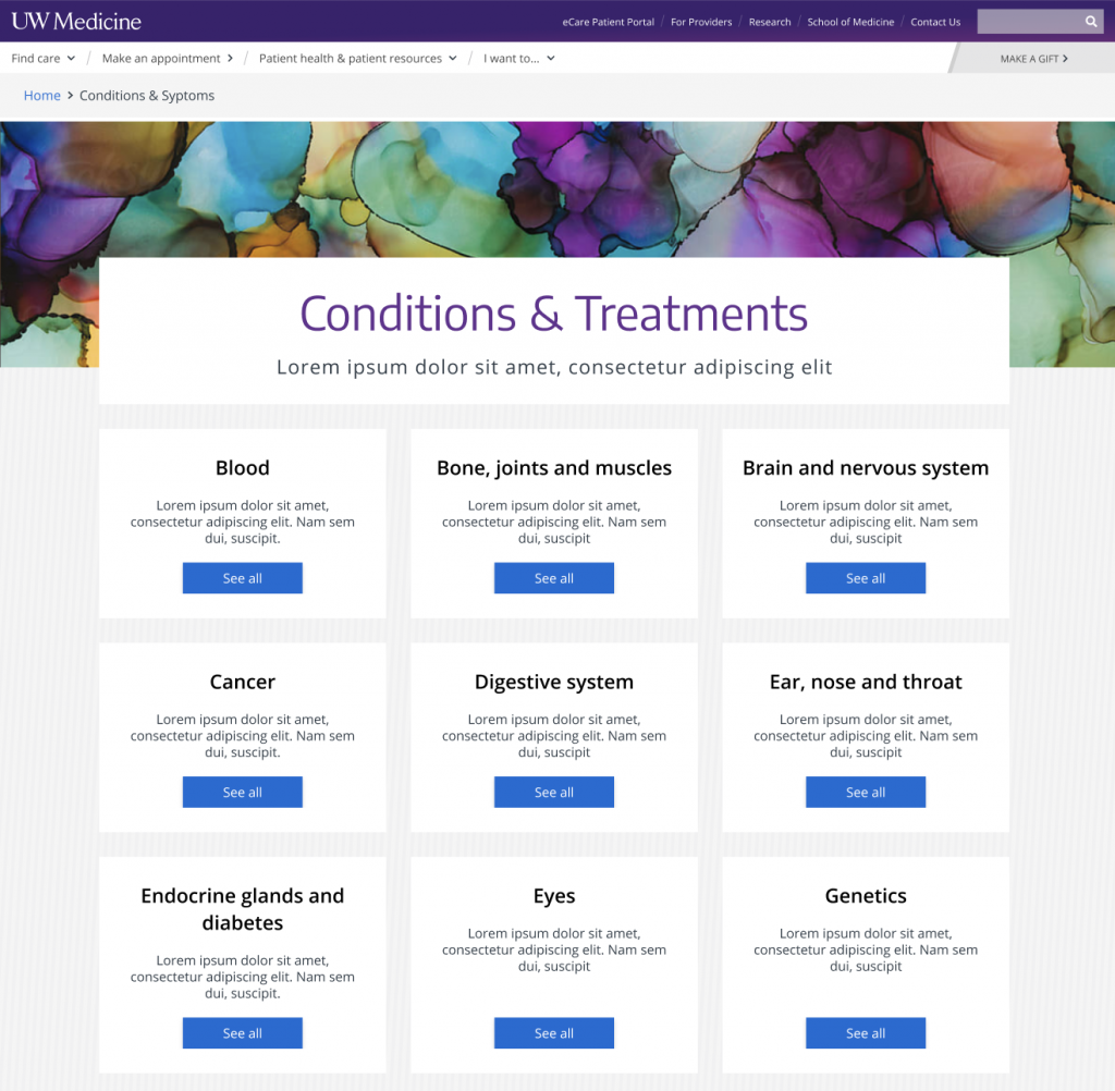
When organizing a directory page, as found in the ‘Conditions’ section —
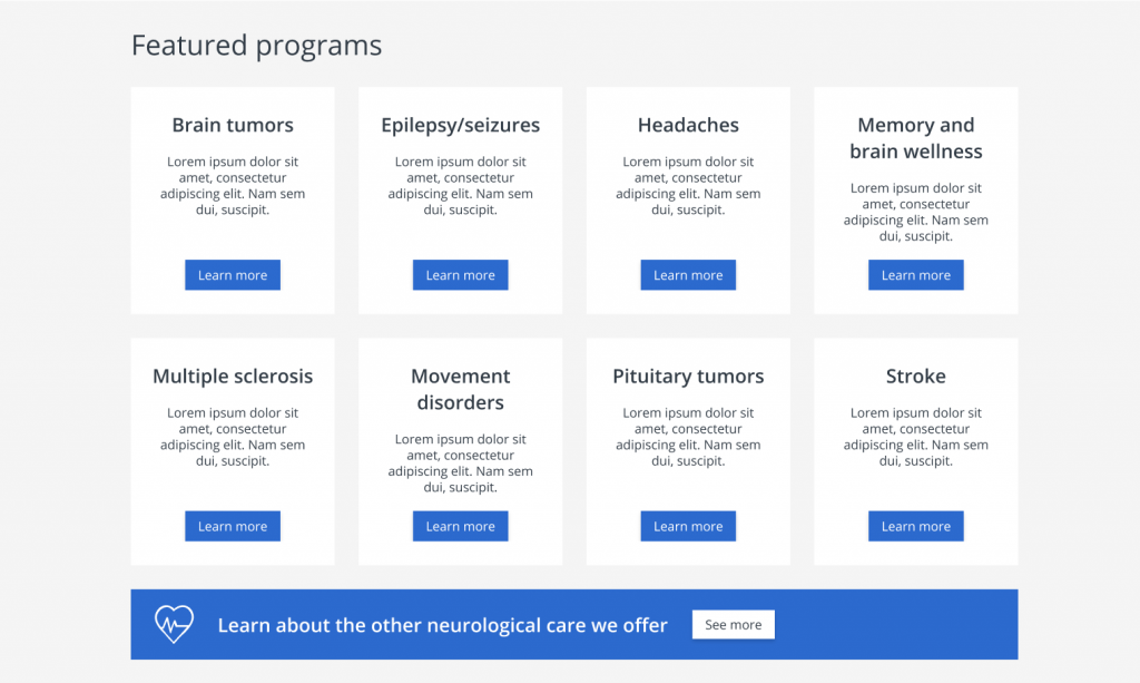
As an organizational element when presenting structure with a chance to ‘learn more’ —

Standard Cards
Standard cards are built with an image, header (H3) and the following optional elements:
- Body text
- List of links
- Button
It is recommended that the cards always have an image and a header.
If the following optional elements are present in the cards, they will appear in the following order:
- Body text
- List of links
- Button
These optional elements in the card, cannot be added in a sequence other than the above indicated order.
Usage guidelines (governance)
3 cards in a row
- H3 maximum: 50 characters with spaces
- Body text maximum: 244 characters with spaces
- Body text count variance across cards: Please aim to have all body text blocks for cards in the same row within 14 characters (with spaces) of each other to create visual consistency where possible across longform text in the cards.
- Item in the list of links maximum: 56 characters with spaces
- Button text maximum: 34 characters with spaces
2 cards in a row
- H3 maximum: 75 characters with spaces
- Body text maximum: 454 characters with spaces
- Body text count variance across cards: Please aim to have all body text blocks for cards in the same row within 128 characters (with spaces) of each other to create visual consistency where possible across longform text in the cards.
- Item in the list of links maximum: 100 characters with spaces
- Button text maximum: 34 characters with spaces
List of links
- The minimum number of items in a list of links should be 2.
- The maximum is 7 items in 1 card.
Buttons
- Only 1 button is allowed per card.
- Buttons in a row or section must be the same color.
- The outline button style is the only button style allowed in the standard card.
- Buttons are available in the colors defined below:

Number of cards per row
- You may choose to display 2 or 3 cards per row.
- If the requester asks for 1 card in a row, we need to suggest another treatment to them. The banner content component or basic text and a grid of buttons will often be a good substitute.
Behavior (responsive/height)
- The height of the cards in a row is determined by the “tallest” card.
- The cards are built using grid functionality. In a grid where there are three cards, the maximum width of a card is 350 px. This is the same as the maximum width for provider and location cards.
- The cards should use the same responsive behavior as the provider and location cards. (The card width should decrease until the row transitions to two cards in a row at the 991 breakpoint. Then, the card width should decrease until the 576 breakpoint when the cards stack (one card per row.)
- In the standard card, the image is not clickable.
Standard card examples
The standard card is a very flexible component. Here are a few uses for it:
- Linking to or surfacing patient stories
- Linking to articles or resources
- Linking to clinic or provider bios pages
- Consolidating links to support groups, classes or forms
- Linking to other patient platforms, such as MyChart
- Presenting “infographic” type information in a modular format that responds well across screen sizes
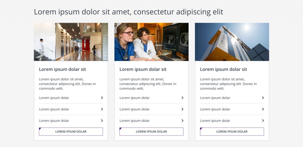
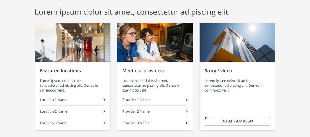
3 cards, all elements – H3, body text, list of links, button:
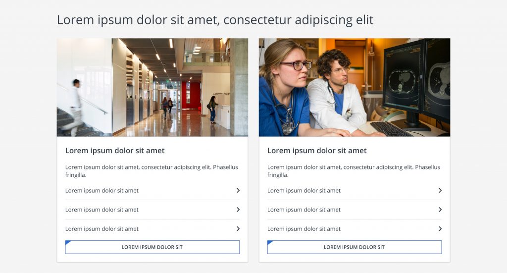
2 cards, all elements – H3, body text, list of links, button:
3 cards – H3, body text, button:
2 cards – H3, body text, button:
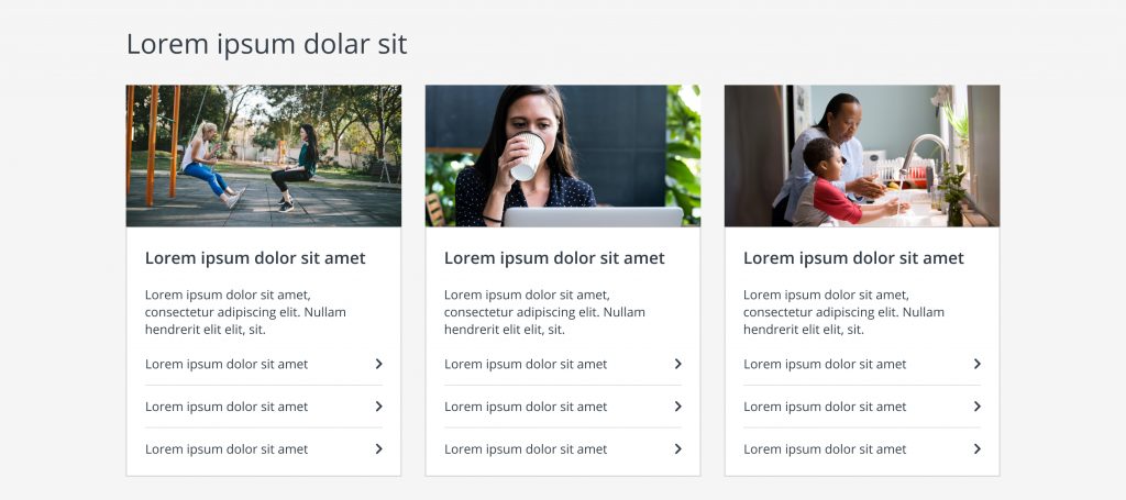
3 cards – H3, body text, list of links:
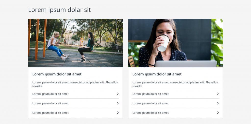
2 cards – H3, body text, list of links:
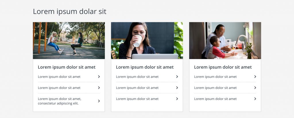
3 cards – H3, list of links:
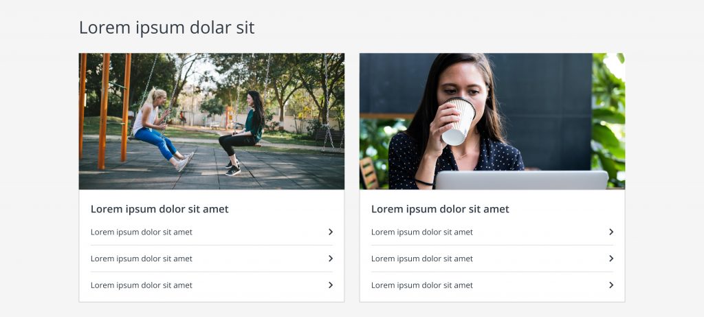
2 cards – H3, list of links:
Card row with mixed internal elements:
Cards within the same row, do not need to have identical internal elements.
Cards within a row should be thematically related, but the content needs should drive the display of elements within each card.
Surfacing featuring providers:
While the transactional provider cards with dynamic information are recommended, providers can also be featured using the standard card, as shown below.
Custom photography is preferred for this use case (first example); however, the same headshot used for their bio headshots can also be added to a patterned background to mimic the look of our bio card/page (second example). If the second example is actioned, there should be a 5 px. white border around the circular headshot.