Buttons

ATTENTION: Page Under Construction!
For image size specifications for web design components, contact Jen Kho, our UX Designer.
Grid placement + width
Full width buttons
Buttons can be placed in grids of 4, 3, 2 across.


Use full width buttons to:
- Increase button prominence
- Balance content when used with column dividers
Constrained width buttons
The width of the buttons in the grid can be constrained to the width of the longest text string by checking the fluid width setting.
Buttons in this style can appear in the same grids as shown above with 2-4 columns.

Used constrained width buttons:
- If the buttons appear in the first section on the page
- If the button(s) appear in a featured story component
Button styles
Outline buttons
Outline buttons are available in six colors:

Ghost button
Font: Encode Sans Normal
Weight: Medium
Size: 13px
Rule Weight: 1px
Corner Flag Opacity: 40%
Rollover Opacity: 70%
Other: CAPS LOCKS
Example (colors may vary):

Reversed ghost button
Font: Encode Sans Narrow
Weight: Medium
Size: 13px
Rule Weight: 1px
Rollover Opacity: 70%
Justified: Center Align
Example (colors may vary):

List link button
Font: Encode Sans Narrow
Weight: Regular
Font Size & Color: 16px | #474747
Rule Weight & Color: 1px | #BABABA
Rollover Font Color: #2C6ACE
Justified: Left Align
Example:

Fill button
This type of button is used to represent key appointing actions. It can be viewed across the website. It is the most prominent and bold of the UW Medicine button styles intended to cleanly, clearly drive action. It can be found in the split hero component and text grids on the website.
It is blue in color to help repeat users associate it with common actions core to scheduling an appointment.
Inactive styles

Font: Open Sans
Size: 16px
Font line height: 22px
Font color: #FFFFFF
Background color: #2C6ACE
Box-shadow: 0 3px 6px rgba (0, 0, 0 .0.16)
Text case: Sentence
Padding definition

Hover styles

Font: Open Sans
Size: 16px
Font line height: 22px
Font color: #FFFFFF
Background color: #21509C
Box-shadow: 0 3px 6px rgba (0, 0, 0 .0.16)
Text case: Sentence
Capitalization
As shown above, buttons in this style should be sentence case.
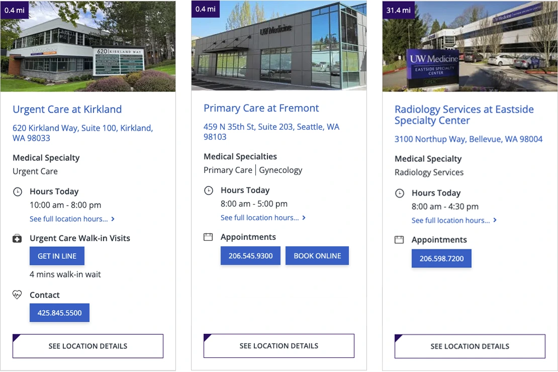
The only time all characters in fill button style should be capitalized, is if it appears within a provider or location card or directly below a row of cards.
The button text is capitalized in cards and directly below them, so all buttons in the cards have consistent text styling, as these cards incorporate a full-width outline button where text is automatically capitalized, and which was the only button style in use when the cards were originally created.
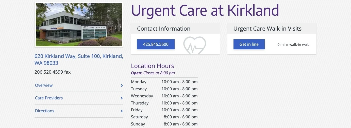
Location or provider card use
Split hero use

Location page use
Text grid use

Homepage buttons
On the homepage the fill button style is represented at a larger scale and with a different color, to enable a high degree of readability when placed against the hero image at the top of the page.
- Inactive color: #32006e
- Hover color: #76236C
