UW Medicine Logo
The UW Medicine logo is the central element in our brand identity program. This logo represents the core of the UW Medicine brand.
The two-color logo is preferred for external brand communications. The black or white logo is recommended when trying to minimize printing costs.
Co-branded partnership logo
You must obtain permission from the UW Medicine Strategic Marketing & Communications team before using a co-branded partnership logo lock-up. Please contact uwmmktg@uw.edu for co-branded logo guidance and permission.
Sharing logos with non-UW partners and organizations
UW Medicine limits the use of our logo and brand to mitigate the risk of real or perceived endorsement of outside products, people or organizations. This includes both commercial businesses and non-profit organizations.
Related policies:
• Protecting UW marks
• Potential financial conflicts of interest for commercial and non-profit entities
If you’re unsure if your logo usage complies with UW Medicine policies, please contact uwmmktg@uw.edu.

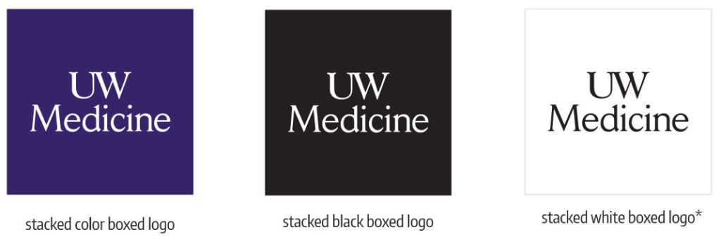
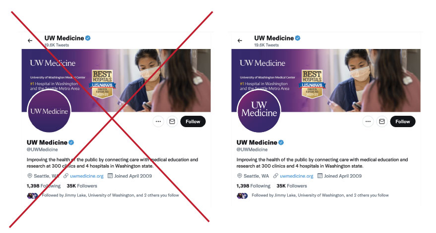
*Please note that the white logo appears in a gray box to illustrate the reverse image. The logo should not be placed in a box.
UW Medicine two-color logo
The two-color logo utilizes our primary brand colors (purple and gold) to provide a more dynamic representation of the UW Medicine wordmark. It can be used in marketing and communications materials as outlined below. We recommend using this logo in all approved co-branding/sponsorship opportunities where color is allowed.
Two-color logo guidelines
Size of logo:
This logo should follow the same size guidelines as the black logo in all creative.
Usage for this logo:
- Only use on lighter color backgrounds.
- Ensure sufficient clear space around the logo; all sides must have a clear space equal to the height of the “W” letter and proportional to the size of the logo.
- Make all logos appear equal in size.
- Center-align the UW Medicine logo horizontally or vertically with other logos.
- Maintain equal distance between all logos.
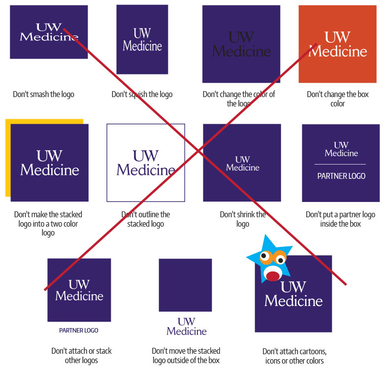
Two-color don’ts
The UW Medicine two-color logo must never be altered, adjusted or redrawn in any way. Inconsistent use detracts from our brand equity and recognition and negates the consistency we strive to achieve. Examples are shown here illustrate incorrect uses of the logo.
Black and white logo guidelines
A clear area equivalent to the height of the W must surround the logo
When reversing the logo, the preference is to reverse a white logo out of the primary purple or black palette. Colors within the color palette may be used in cases where purple or black are not available or are not the best fit (e.g., T-shirts, hats, banners, etc.)
Unacceptable usage of the UW Medicine black and white Logo
Inconsistent use of the UW Medicine logo erodes recognition and brand equity. The following examples illustrate logos that do not meet UW Medicine brand guidelines. The proper standards for logo usage should be applied across the UW Medicine system.
By using the UW Medicine logos consistently and as outlined above, you will strengthen the overall UW Medicine brand.
Black and white logo size requirements
Logo minimum size requirements are shown right. It is important to be consistent and precise, as the size of the type ensures readability of the logo.
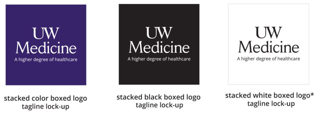
Logo with higher degree tagline lock-up
The UW Medicine logo/tagline lock-up reinforces our clinical excellence and unique brand position as the region’s only academic health system. This lock-up can be used on all communications in place of the standard logo. When using this lock-up, the elements may not be altered or rearranged in any manner. Size requirements for the standard logo apply to this lock-up as well. For more information about the tagline, please review the “tagline” section on this site.
No other tagline is allowed with the UW Medicine master brand logo.
*Please note that the white logo appears in a gray box to illustrate the reverse image.The logo should not be placed in a box.
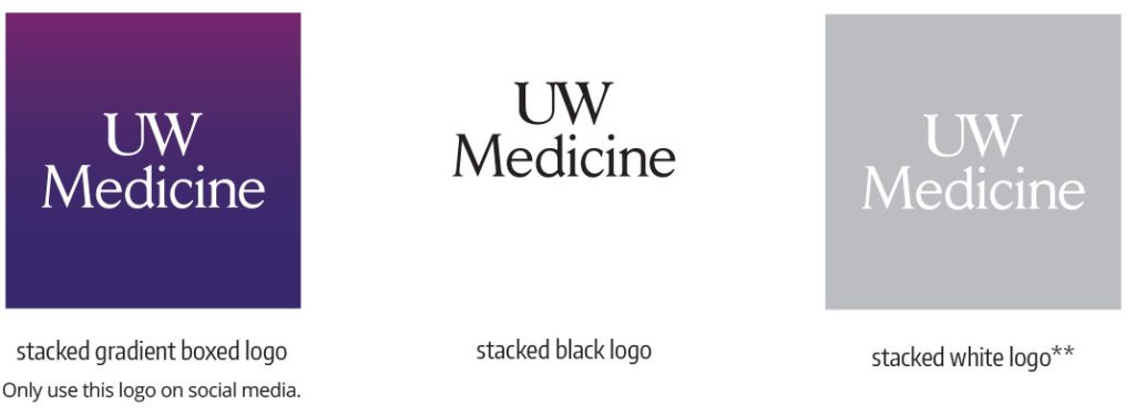
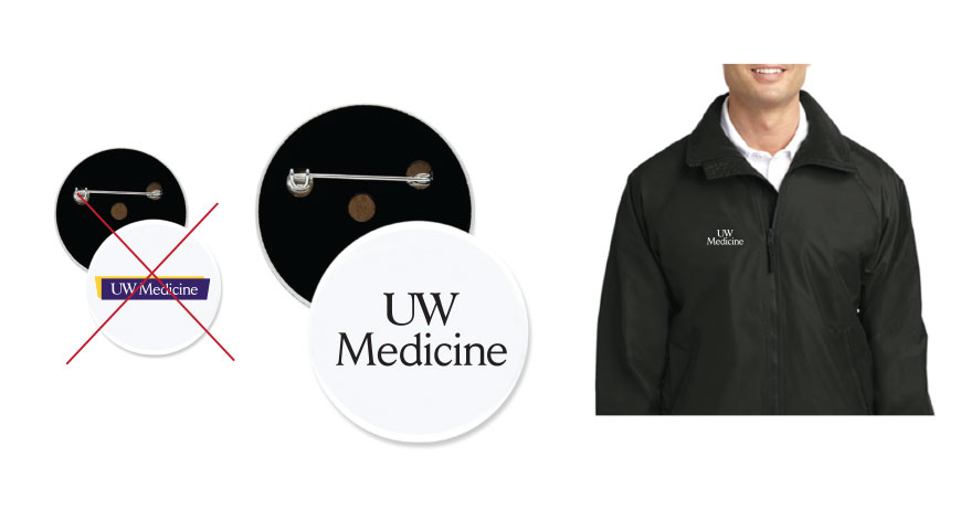
Stacked logos
We designed UW Medicine’s stacked logo for smaller formats where our regular horizontal logo doesn’t fit. This stacked logo doesn’t replace the other prominent horizontal logos; please refer to the two-color, black or white logo first. The stacked logo uses our primary UW Medicine wordmark only. Only use our stacked logo in co-branded materials when other entities use their stack logos.
When and where to use this logo:
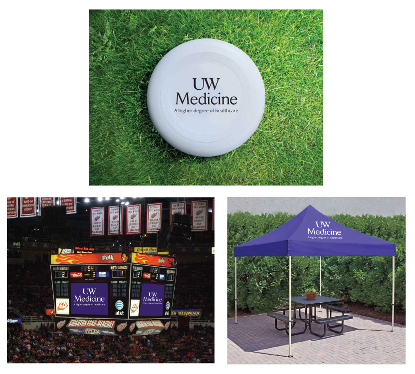
The stacked logo should only be used when the primary UW Medicine logo is too small to read, such as in some digital applications and on branded promotional products.
Don’t use the stacked logos on any of the following materials:
• Business cards • PowerPoint • Branded envelopes • Brochures • Fact sheets • Letterhead • Email signatures • Email templates flyers • Printed signage
Size of stacked logo:
A clear area equivalent to the height of the “UW Medicine” must surround the logo.
Usage for this logo:
• Ensure sufficient clear space around the logo.
• Make all logos appear equal in size.
• Center-align the UW Medicine logo.
• Align horizontally or vertically with other logos.
• Maintain equal distance between all logos.
Stacked logo don’ts:
The UW Medicine stacked logo must never be altered, adjusted or redrawn in any way. Inconsistent use detracts from our brand equity and recognition and negates the consistency we strive to achieve. Examples are shown here to illustrate incorrect uses of the logo.
Stacked logo higher degree tagline lock-up:
The UW Medicine stacked logo/tagline lock-up reinforces our clinical excellence and unique brand position as the region’s only integrated clinical, research and learning health system. This lock-up can be used on some communications in place of the stacked logo. When using this lock-up, the elements may not be altered or rearranged in any manner. Size requirements for the standard logo apply to this lock-up as well. For more information about the tagline, please review the “tagline” section on this site. When using this lock-up logo all words need to be larger than 8pt (as shown). No other tagline is allowed with the UW Medicine master brand logo.
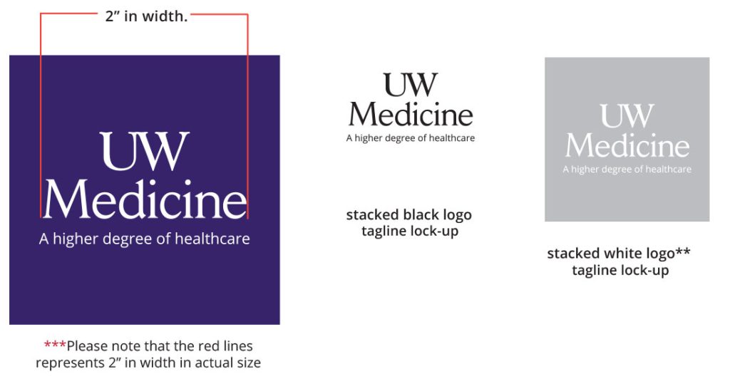
When and where to use the tagline logo:
Use the stacked tagline logo in areas where the “higher degree of healthcare” will be readable to all audiences. DON’T USE the Higher Degree tagline logo lock-up on any digital applications. The tagline will not be readable on mobile devices.To use the stacked logo with the tagline in print collateral, the “Medicine” needs to be at least 2″ in width.
Don’t use the stacked tagline logos on any of the following materials:
• Business cards • PowerPoint • Branded envelopes • Brochures • Fact sheets • Letterhead • Email signatures • Email templates flyers • Printed signage