Colors
We’ve selected our color palette and style to create an energetic new look with a welcoming personality. Purple is the primary color and the same shade used by the University of Washington, taking advantage of the strong UW brand equity. We’ve also added a modern gradient treatment, which adds life, movement and energy to our header, footer and color blocks.
Our secondary palette complements our primary colors, breathing life and adding flexibility into our communications. These colors have a modern feel and are friendly, warm and inviting.
Primary color
Primary palette
American Disabilities Act (ADA) web color compliance
The American Disabilities Act (ADA) standards must be followed and will dictate color contrast choices. When paired together, not every color in the primary and secondary palettes will meet the Web Content Accessibility Guidelines 2.0. We encourage you to check your color combinations with the links below:
• Color contrast needs to meet WCAG 2.0 compliance, with Level AA:
http://www.washington.edu/accessibility/web/color
• Full guidelines can be found at:
http://www.washington.edu/accessibility
Secondary palette
Additional assets
UW Medicine gradient
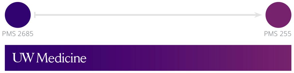
This gradient can be used for header, footer and color blocks. While use of this gradient is not required, it is highly recommended. The gradient is a mixture of the primary UW Medicine purple, PMS 2685, and the secondary purple, PMS 255. To achieve this gradient swatch, the Pantone colors must be converted from spot to process otherwise you will get a gray tone between the two colors as they mix. Note that the color break between the two colors should start roughly at a 5:1 ratio in favor of the primary purple.
The UW Medicine logo can only rest within the primary purple so you may need to adjust the gradient as needed to ensure that the logo is placed properly within the gradient color.
UW Medicine angled background

A 15-degree angle is used throughout the brand graphic elements. The angle mimics the angle of the university’s block W logo and reinforces the familiar shape. On its own, the angle creates interesting graphic lines, shapes and textures.
A repeating pattern of 15-degree lines creates the angled background texture. Use this to accent your brand designs. Keep minimal contrast between the texture and your background — this element should be subtle.